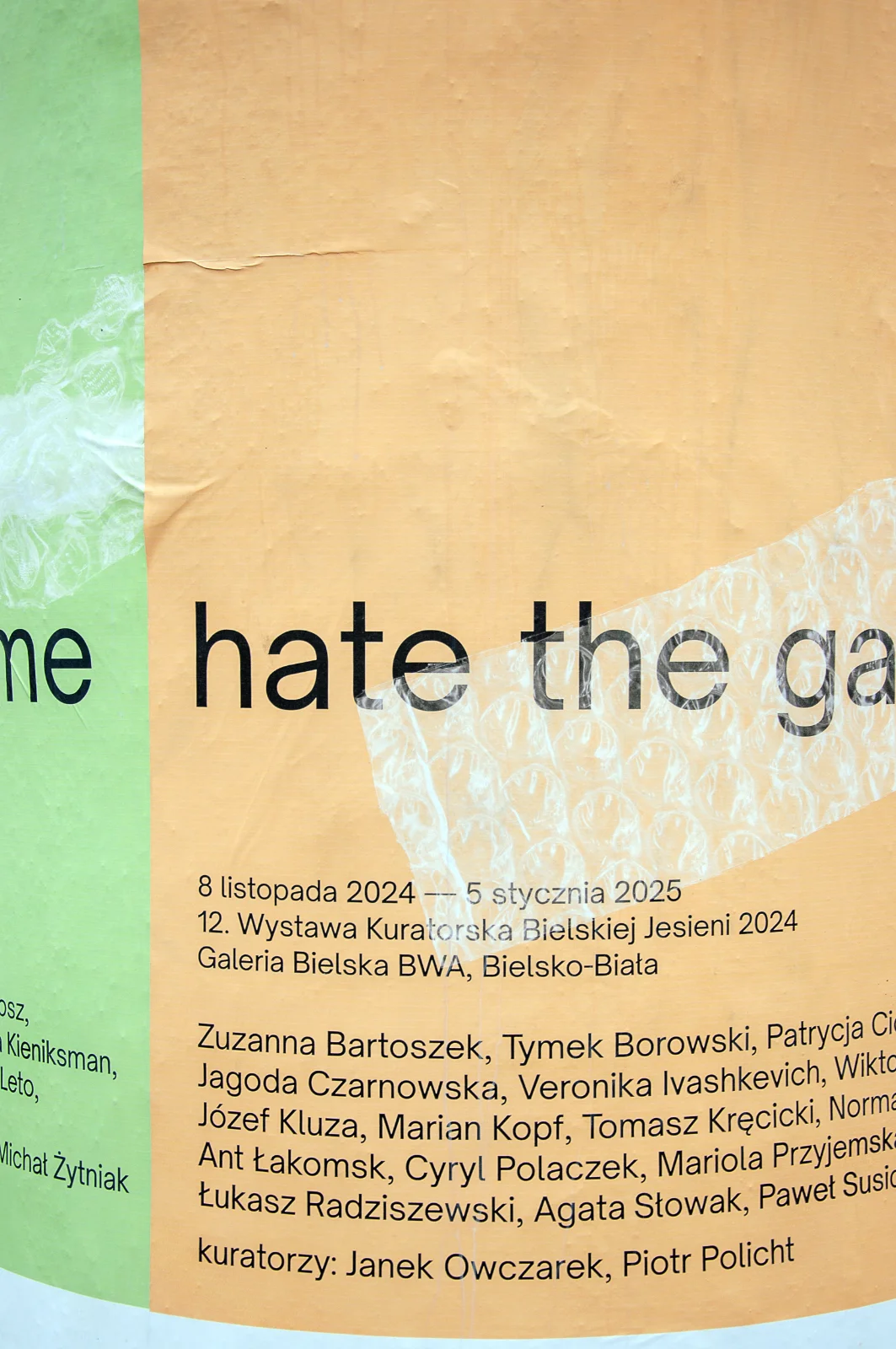
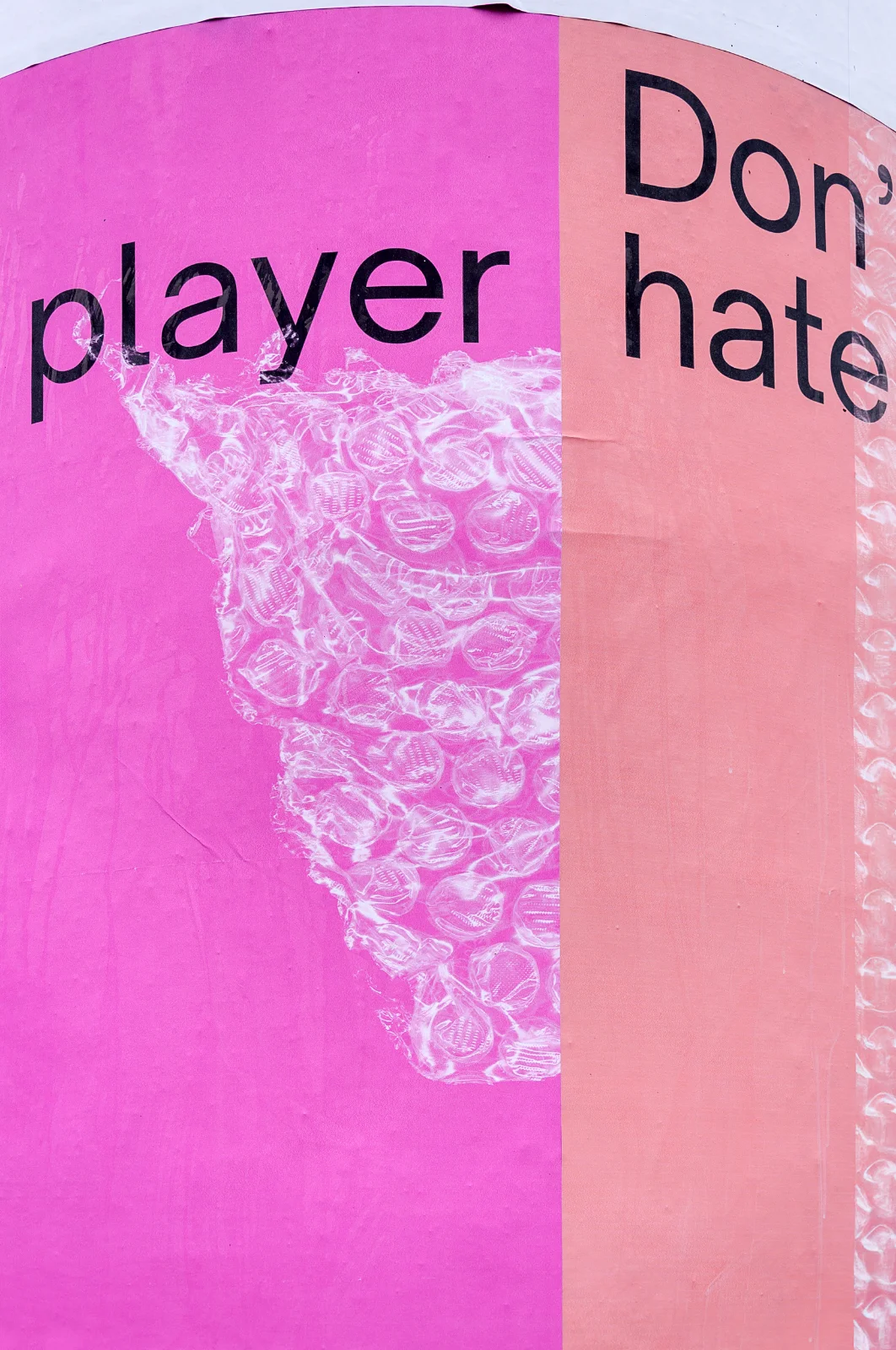
Don’t hate the player, hate the game
2024
“Bielska jesień” [Bielsko Autumn] is the most important painting competition in Poland, held every two years. In the years between editions, a curated exhibition is organised.
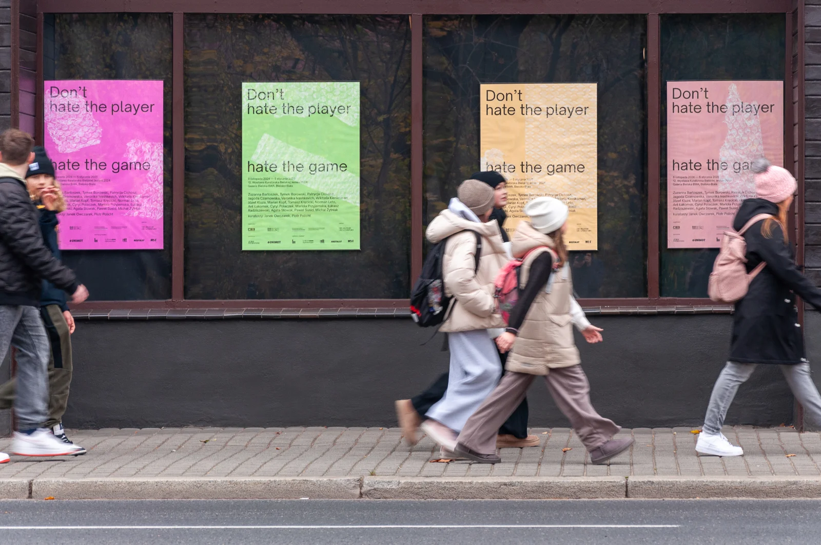
In 2024, the exhibition was titled Don’t hate the player, hate the game, curated by Janek Owczarek and Piotr Policht. The curators explored the relationship between painting and the art market, presenting examples of how artists navigate galleries, collectors, and their own creative needs. In the introductory text, they wrote:
Painting has been, is, and will continue to be a commodity. Good painting can be recognised by the fact that it is something more.
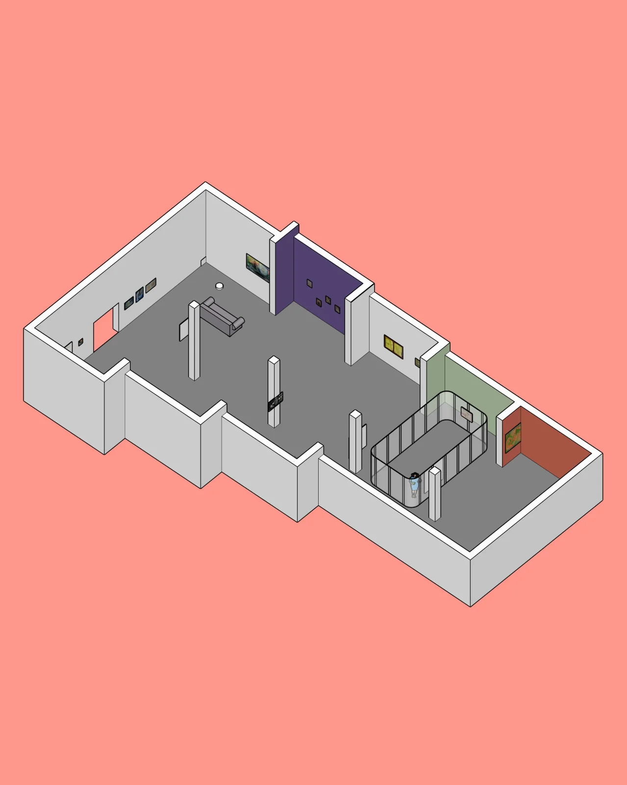
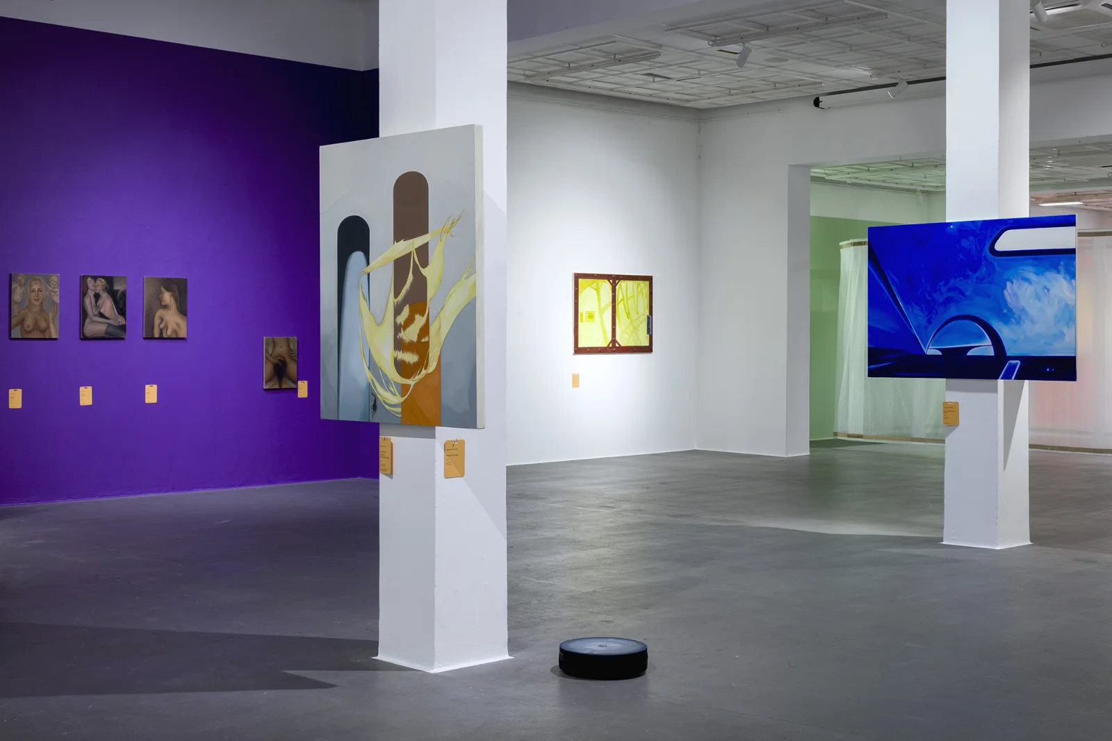
I led the creative direction of the event, designing the posters, exhibition display, and catalogue.
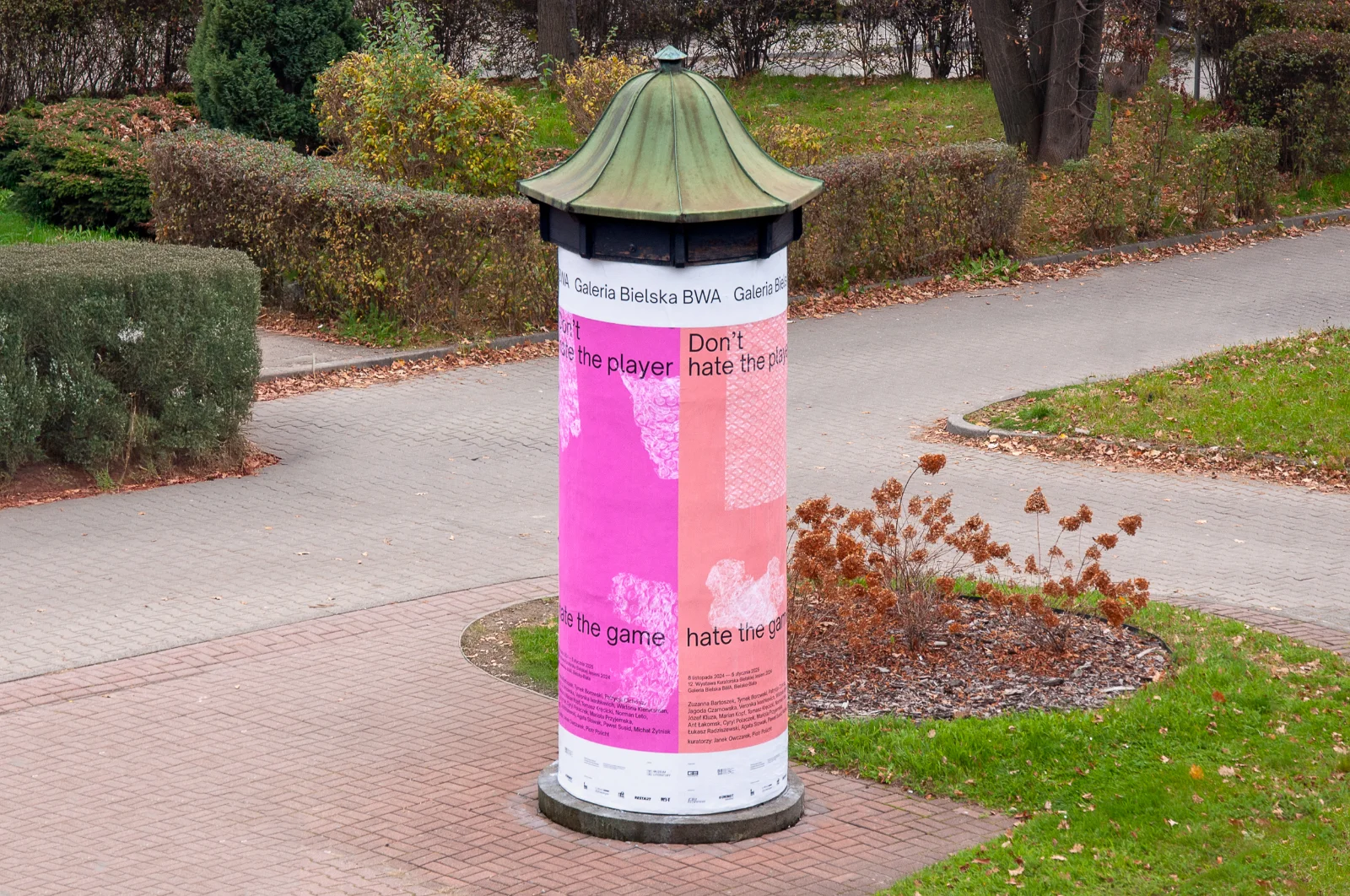
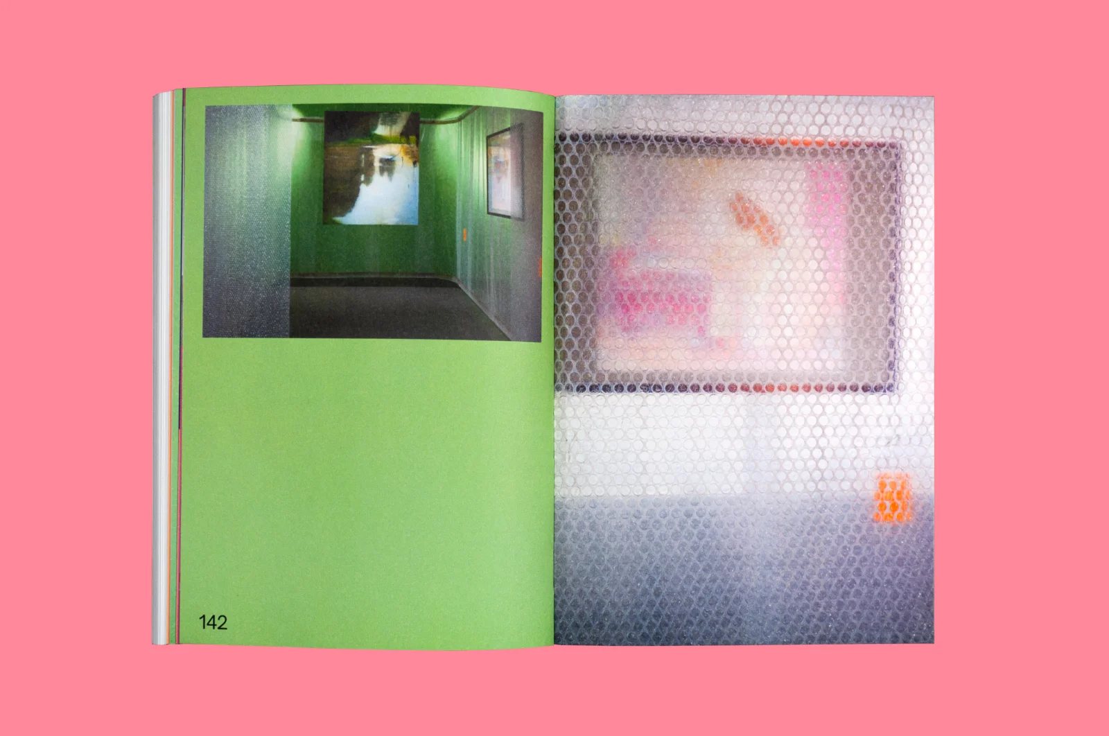
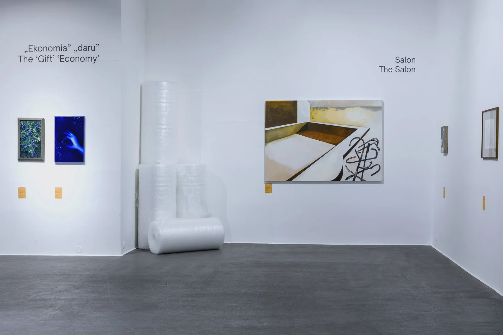
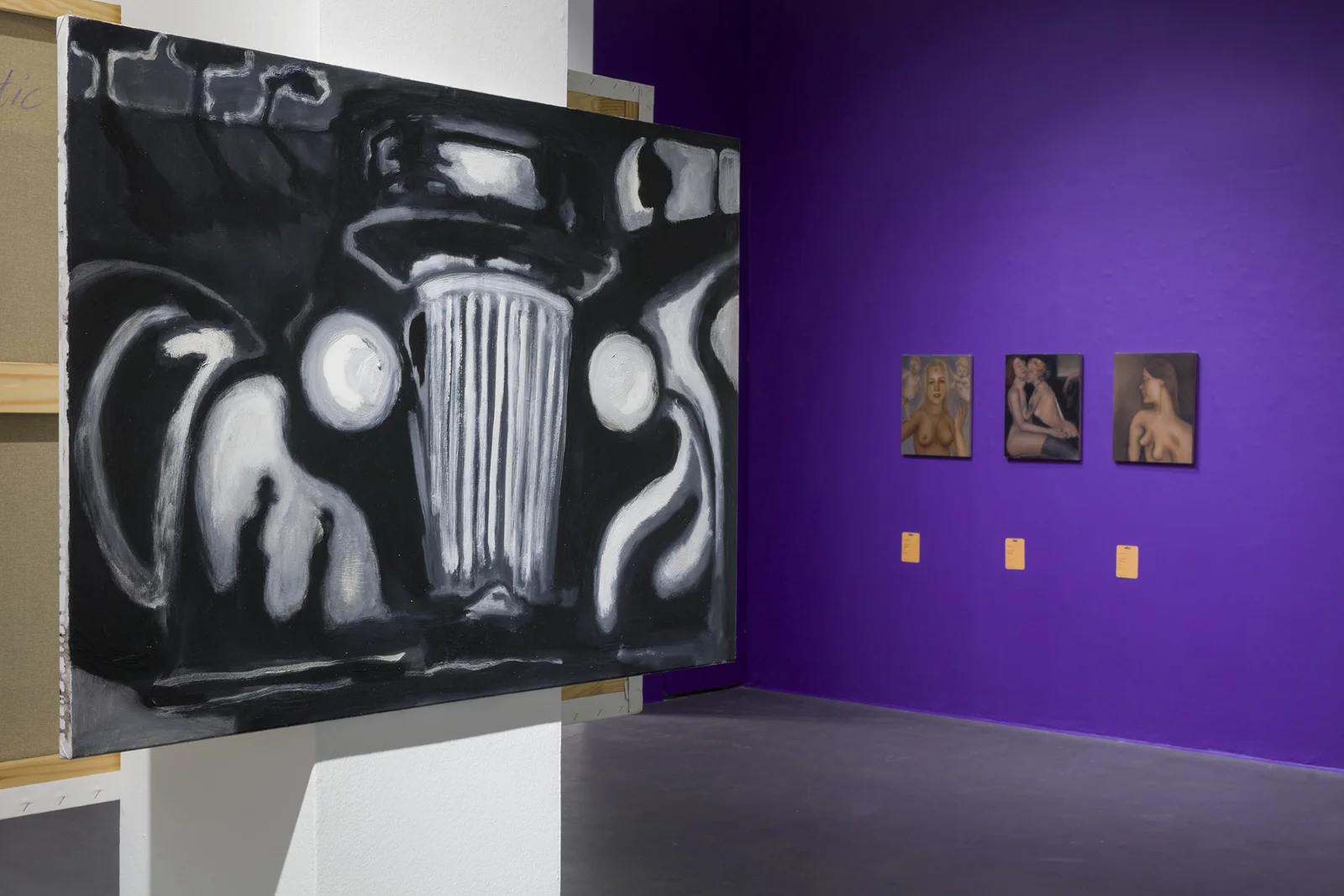
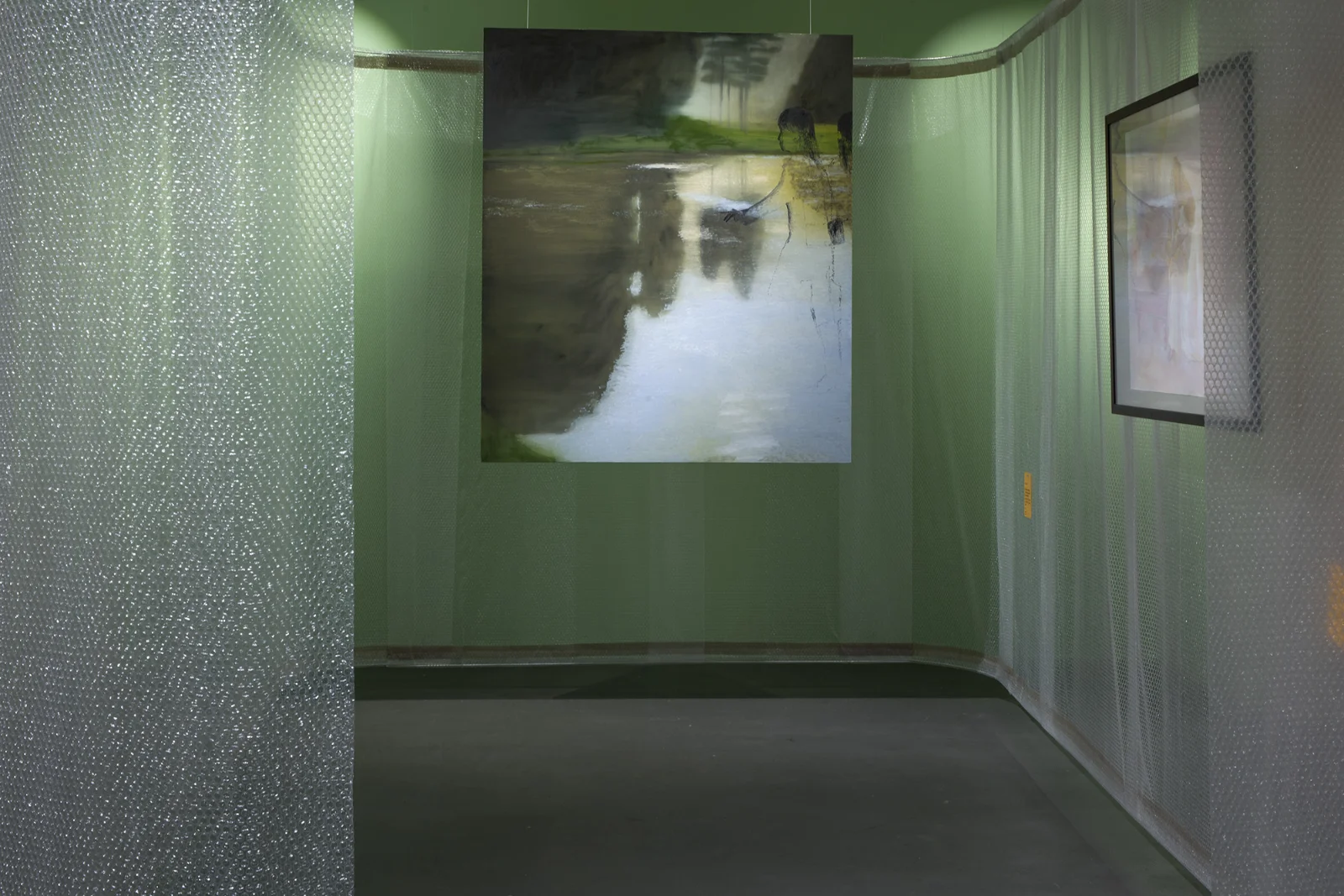
Bubble wrap became the main element of the the exhibition’s visual identity. At times it covered, at others it revealed typography and images. This material is commonly used to package paintings in galleries; once wrapped, the canvas becomes a commodity. The posters and promotional materials used four pastel colours — magenta, green, orange and pink. The typography was based on a single sans-serif typeface – Open Sauce, with contrast created by scale and spatial relationships.
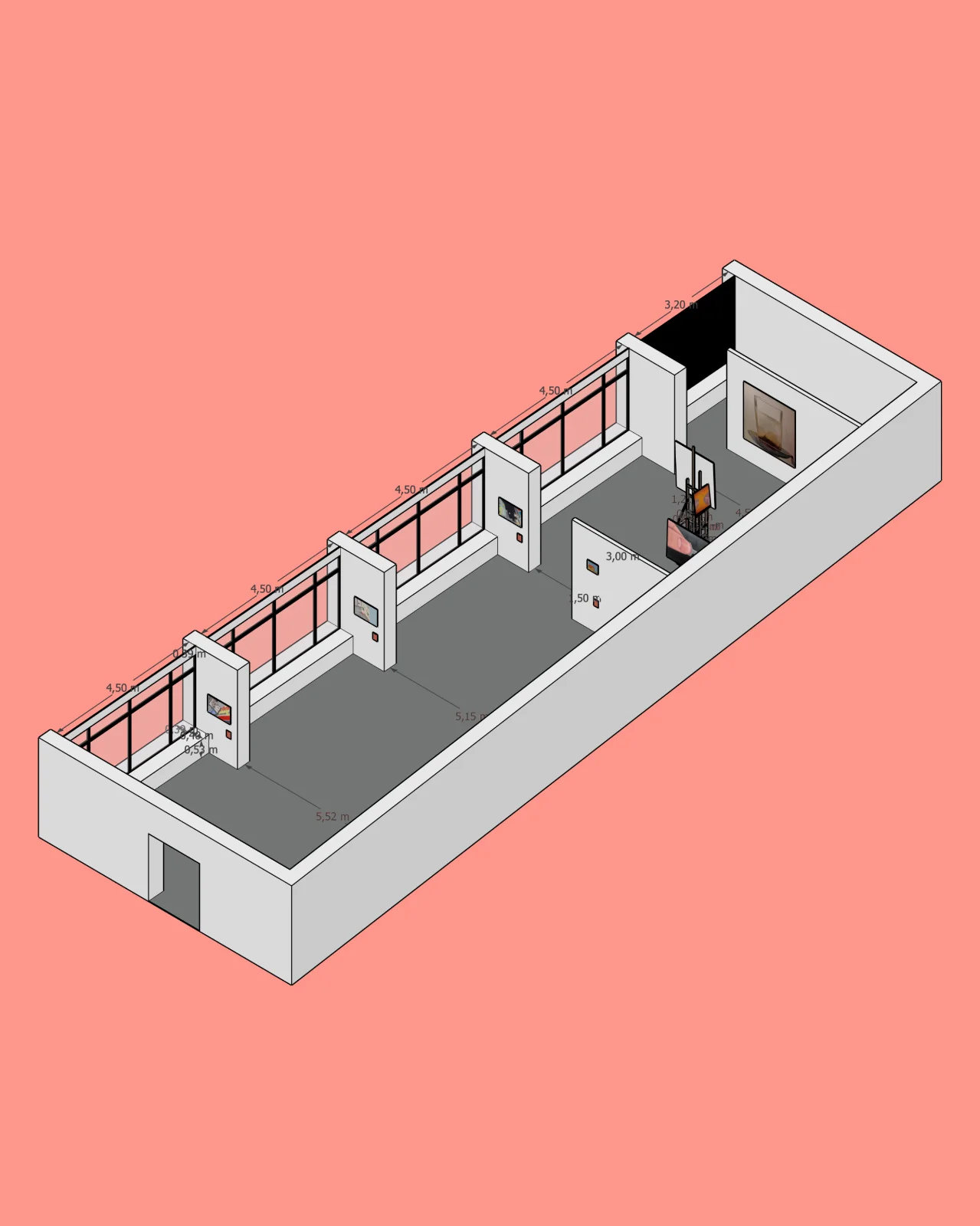
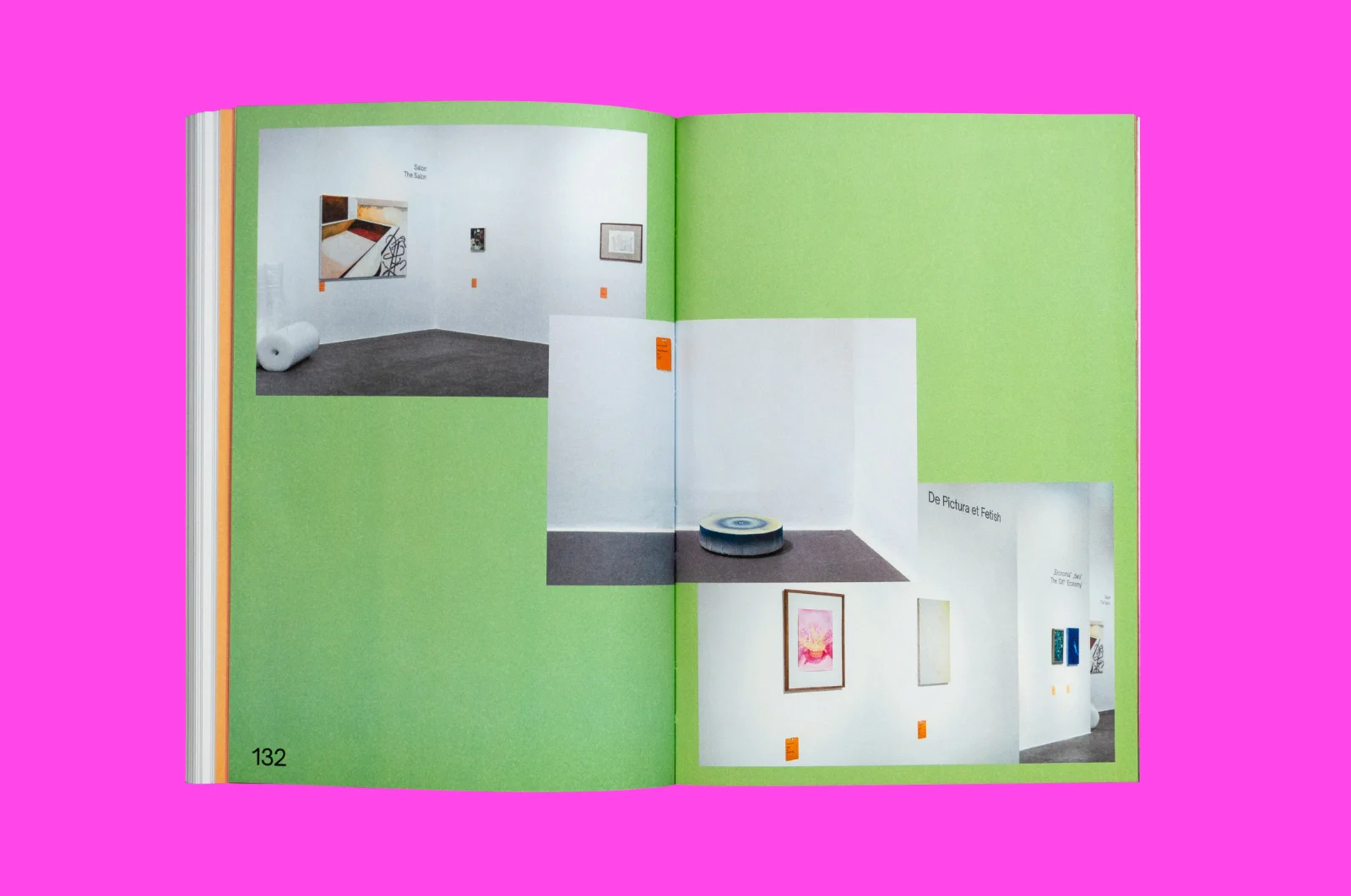
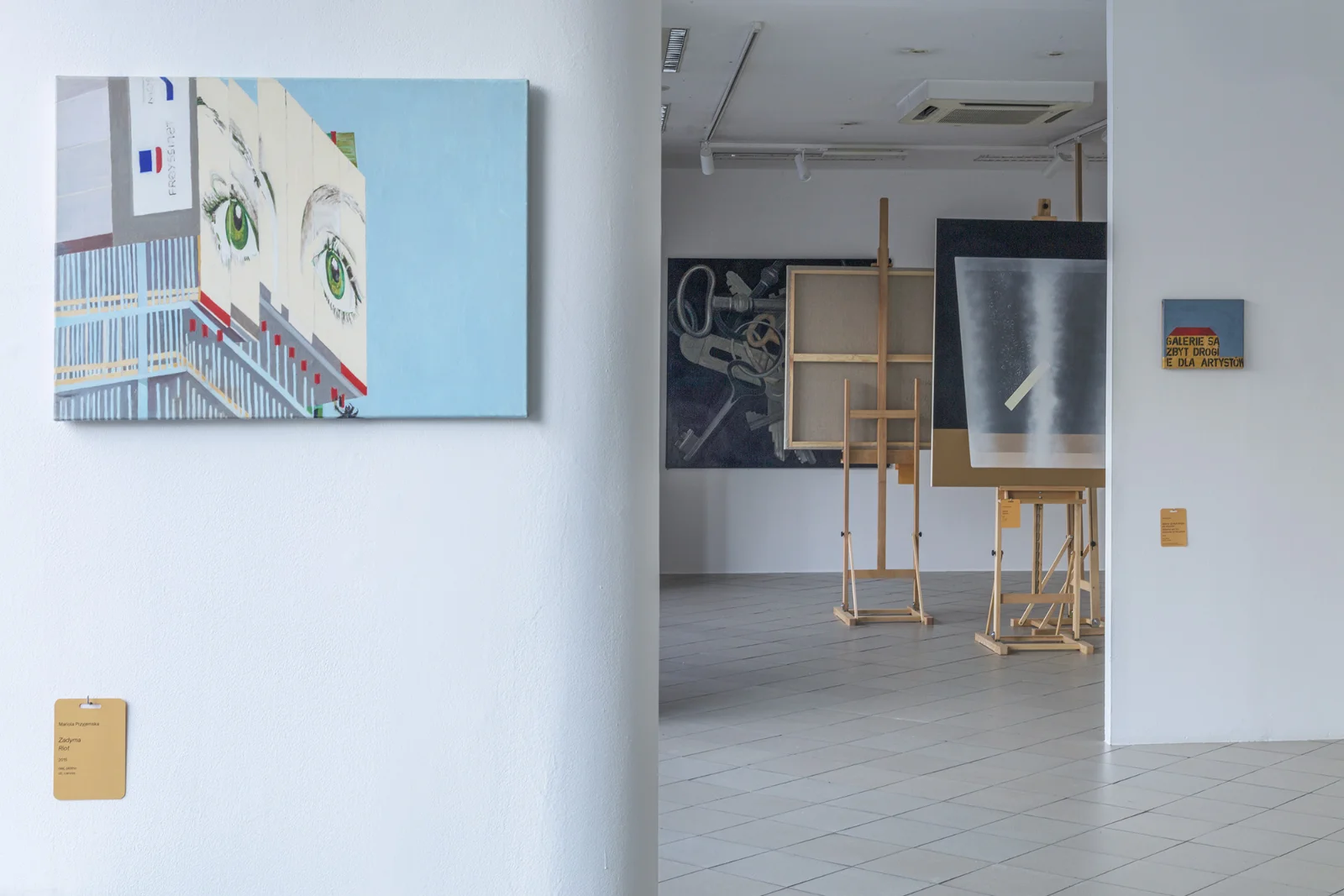
The exhibition occupied two floors of Galeria Bielska BWA, and bubble wrap also shaped the display design. Its rolls stood in the gallery much like they would in the storeroom of a private gallery or collector.
Photos by Krzysztof Morcinek
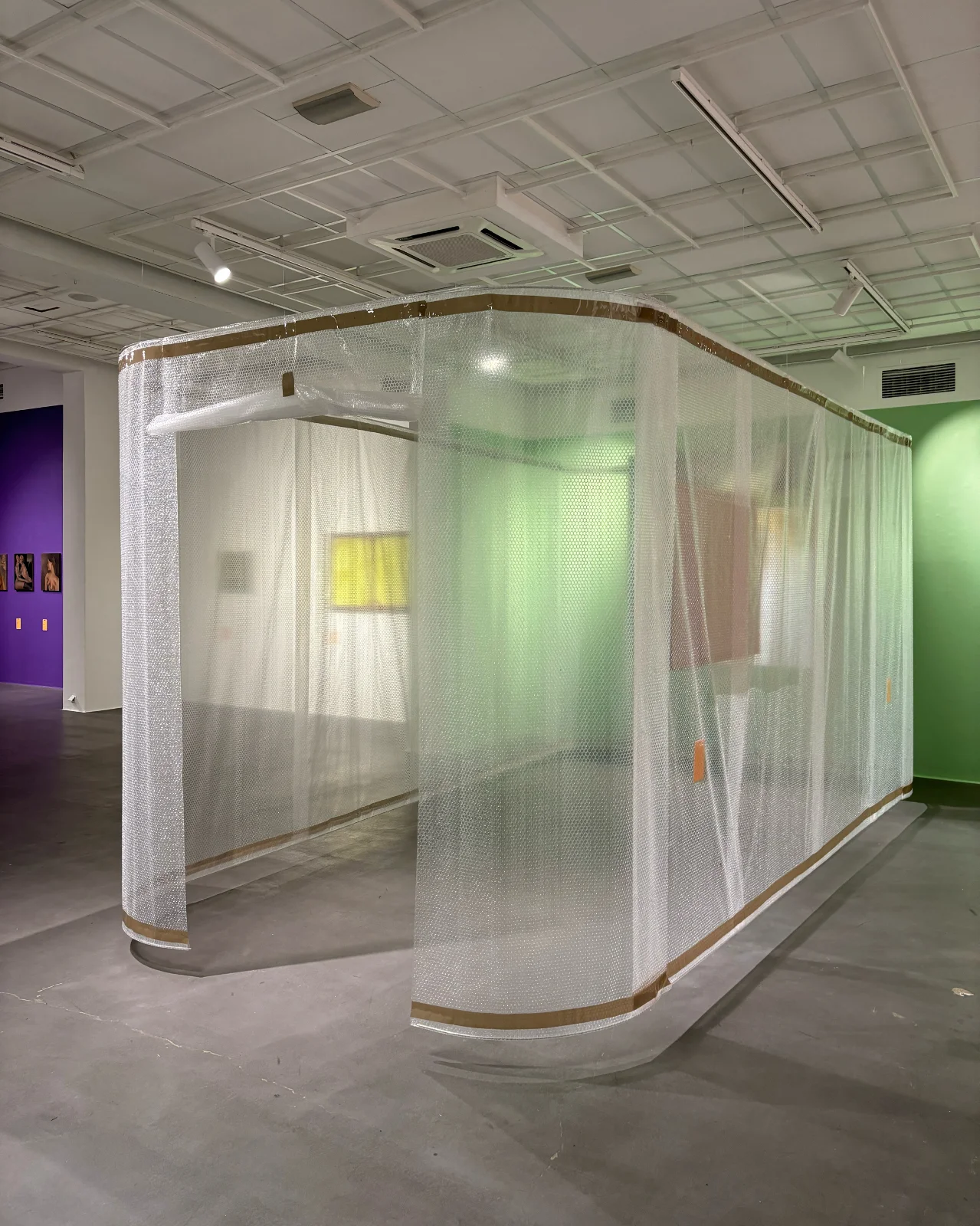
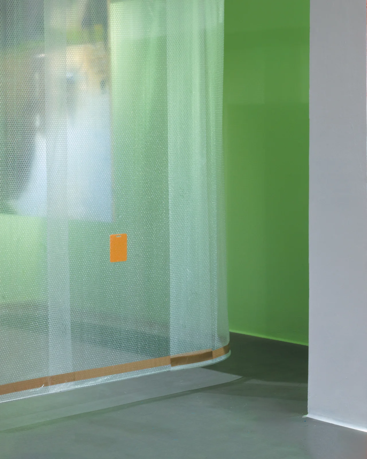
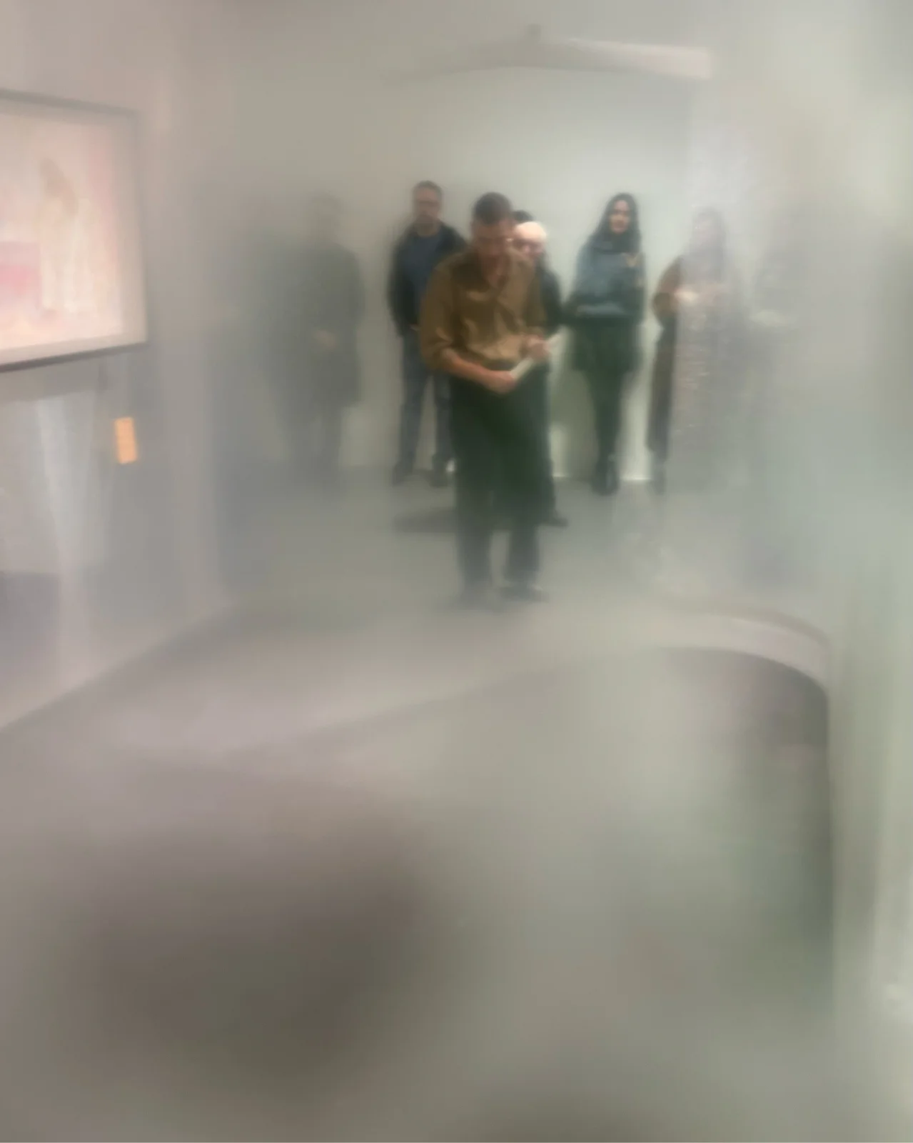
On the upper floor, a chapel-like room made from bubble wrap was constructed. Its transparent walls concealed paintings, making viewers feel as though they were packed together with the works.
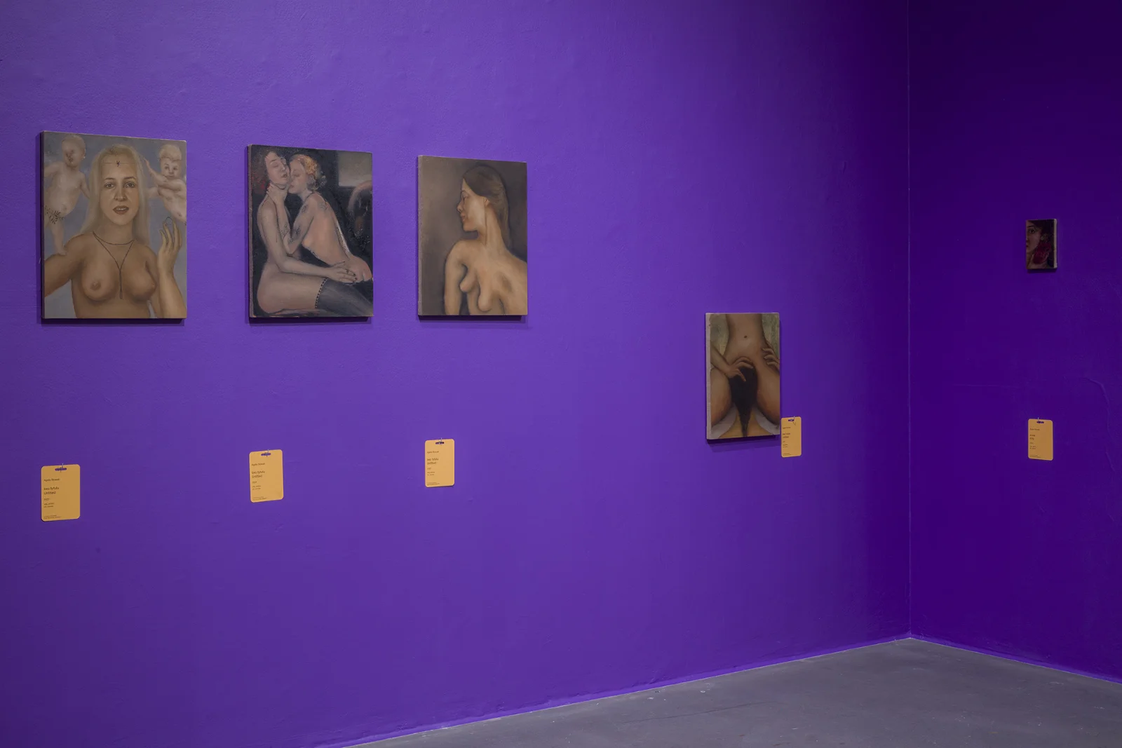
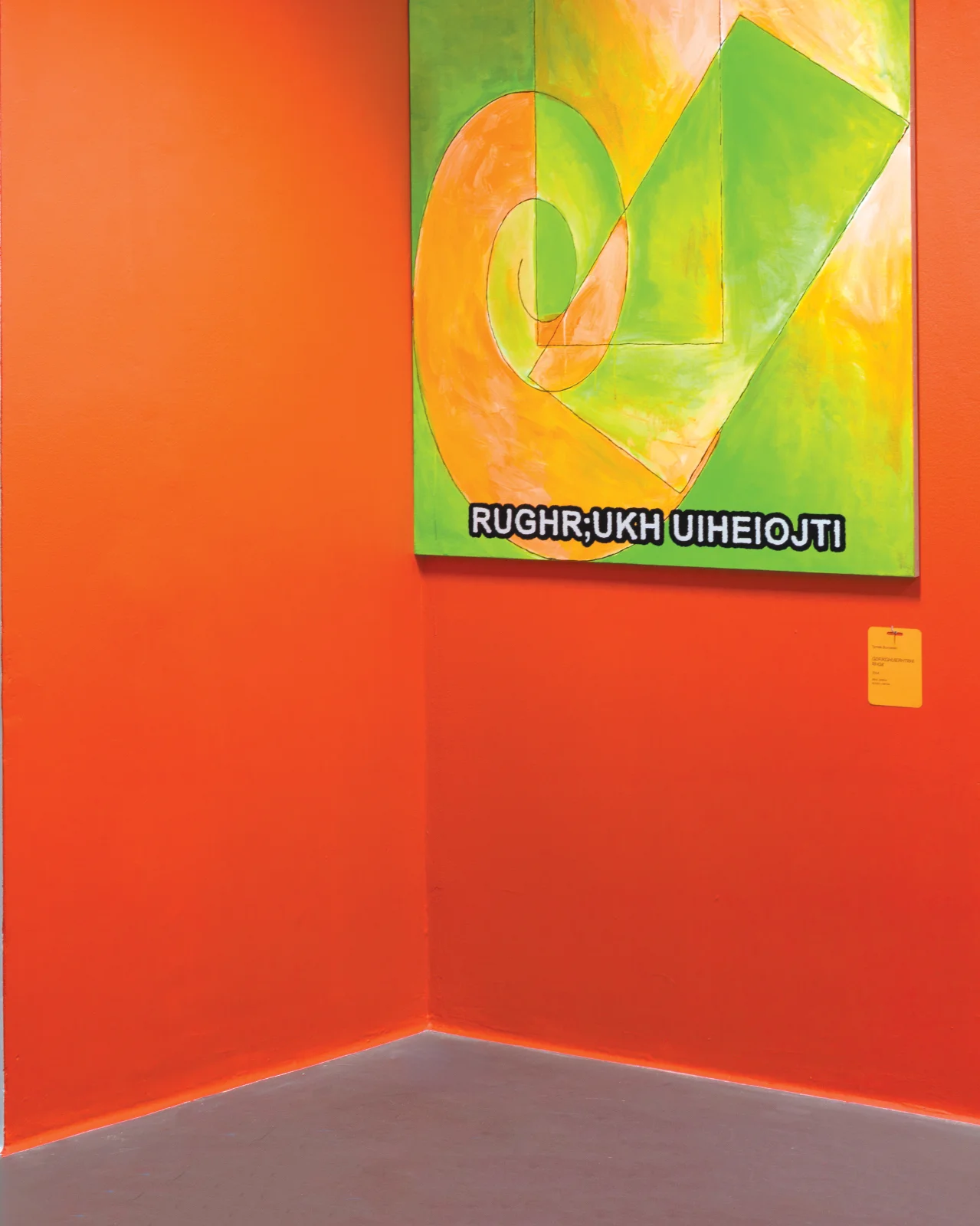
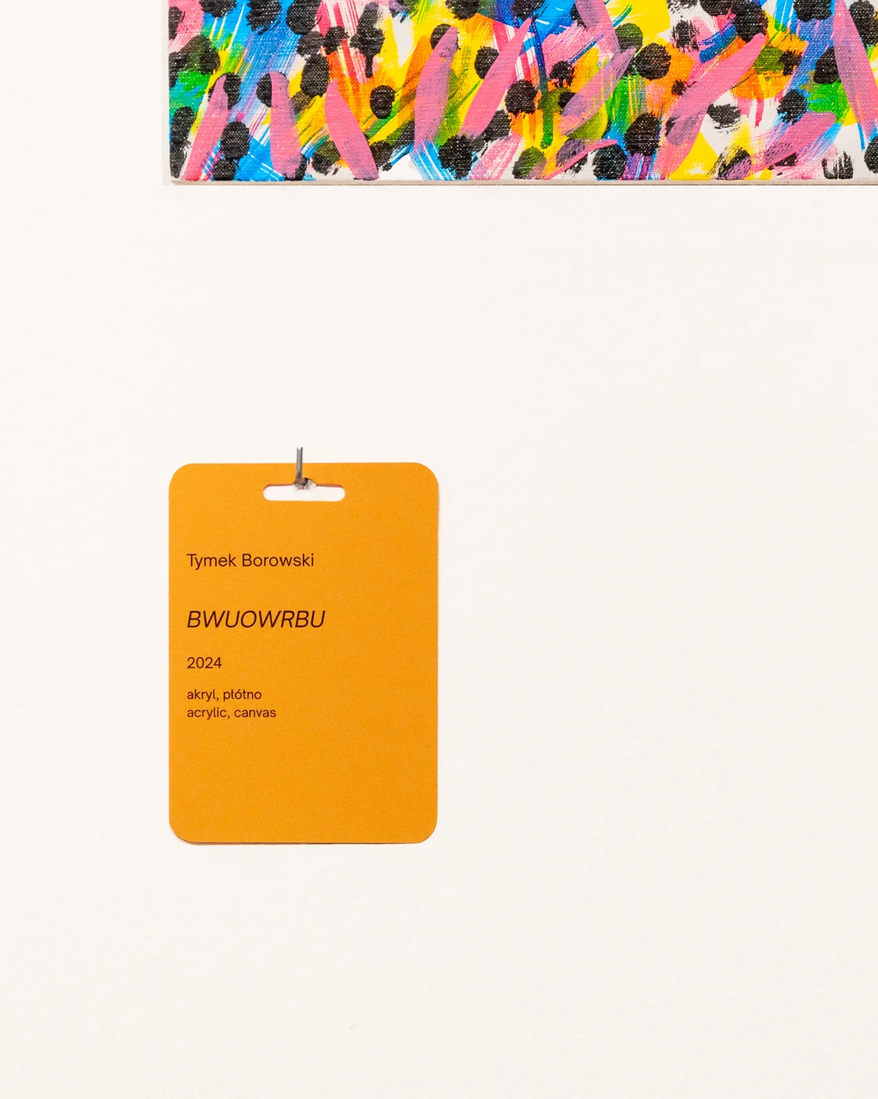
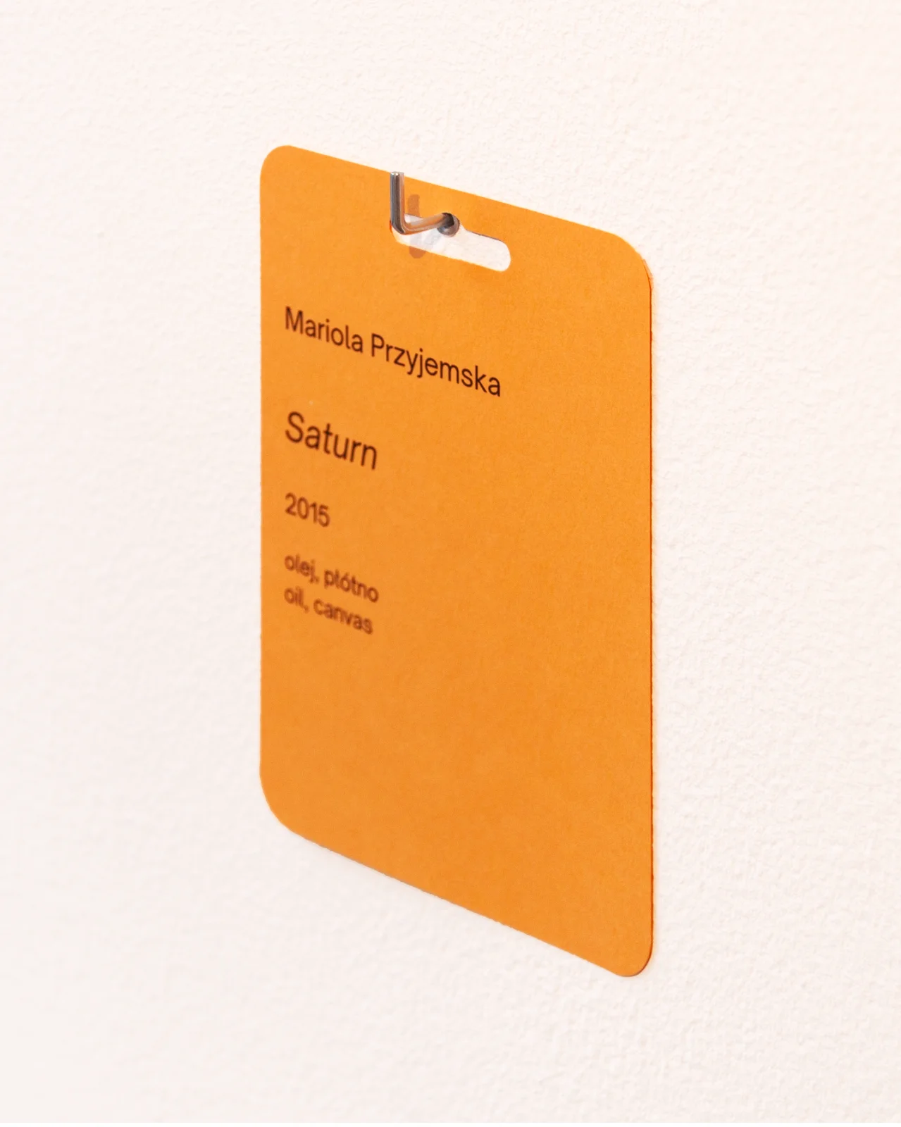
I pay particular attention to typographic details. Technical descriptions of the artworks were printed on paper plates resembling shop labels, complete with mounting slots shaped like Euro holes, commonly used for displaying products on retail shelves.
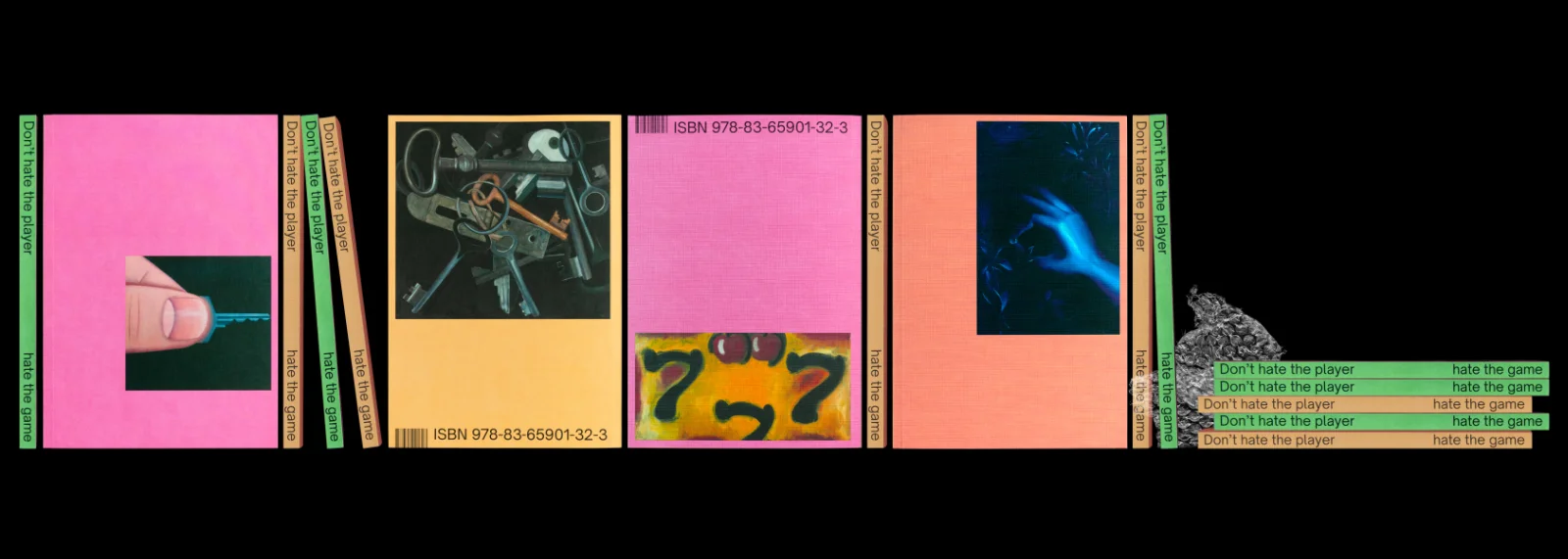
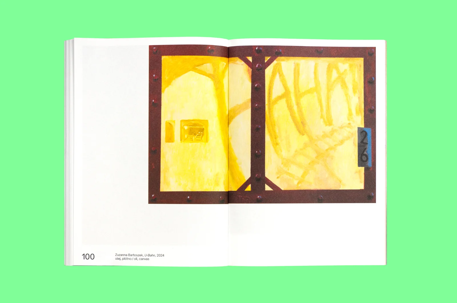
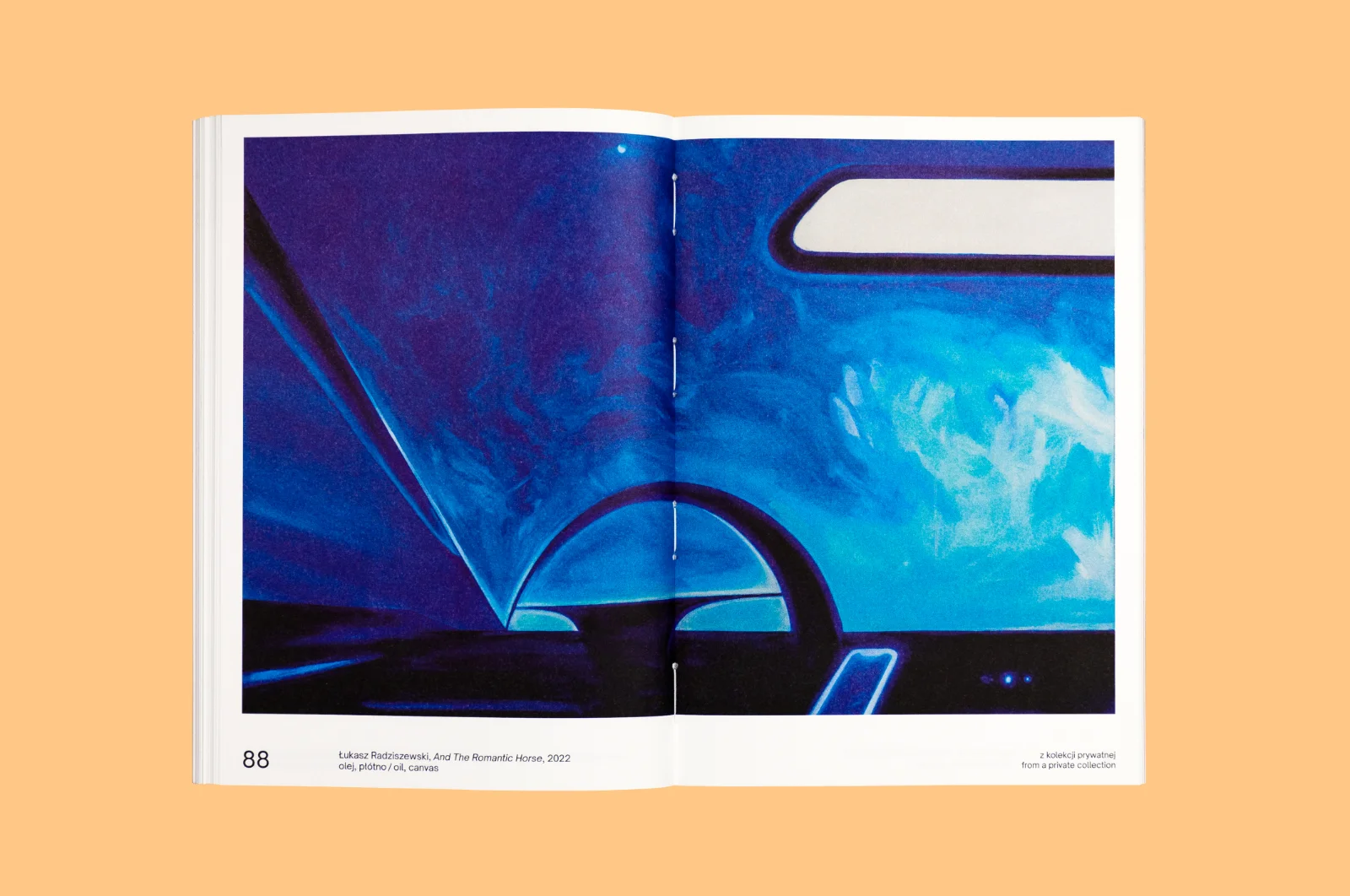
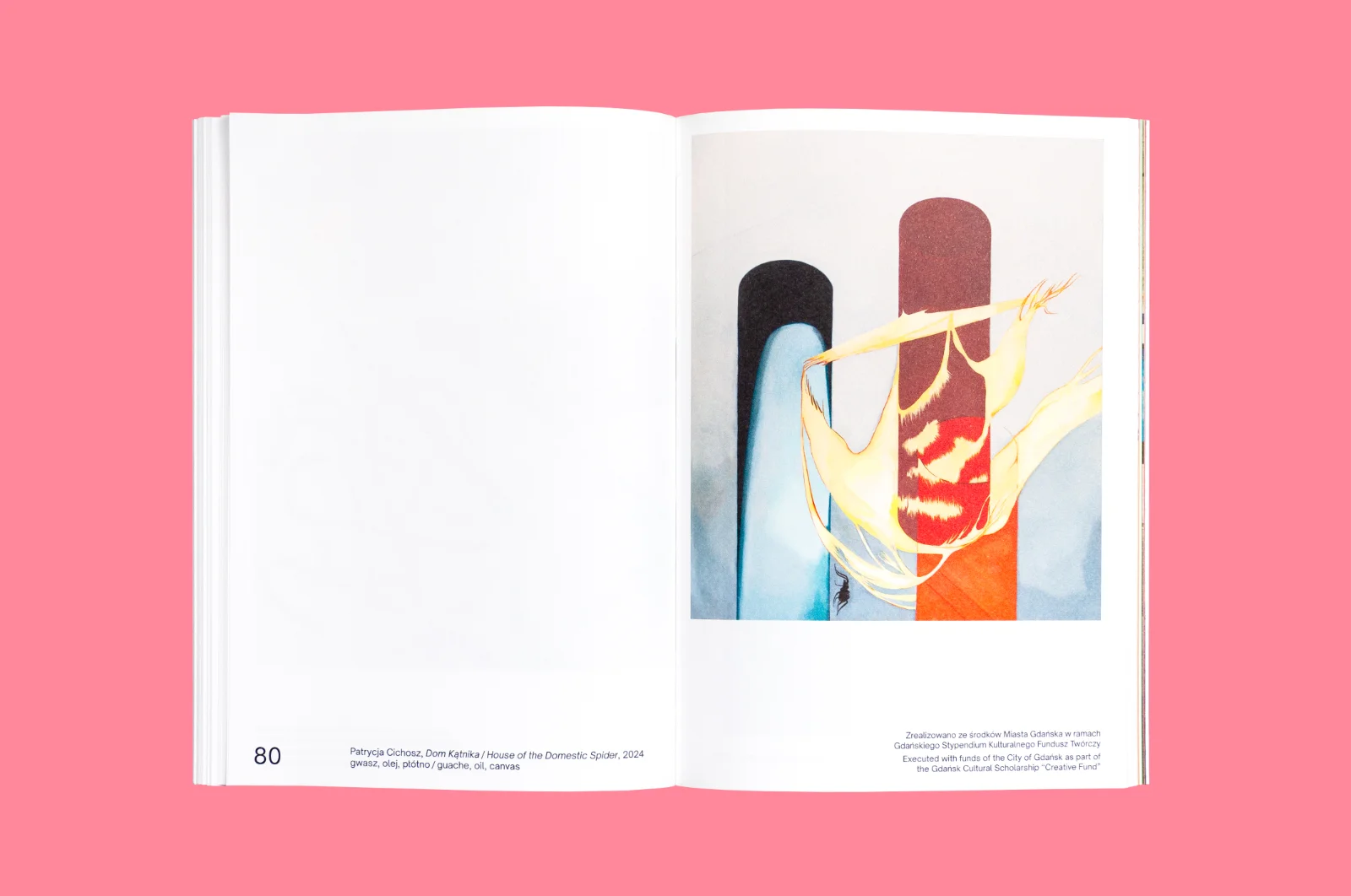
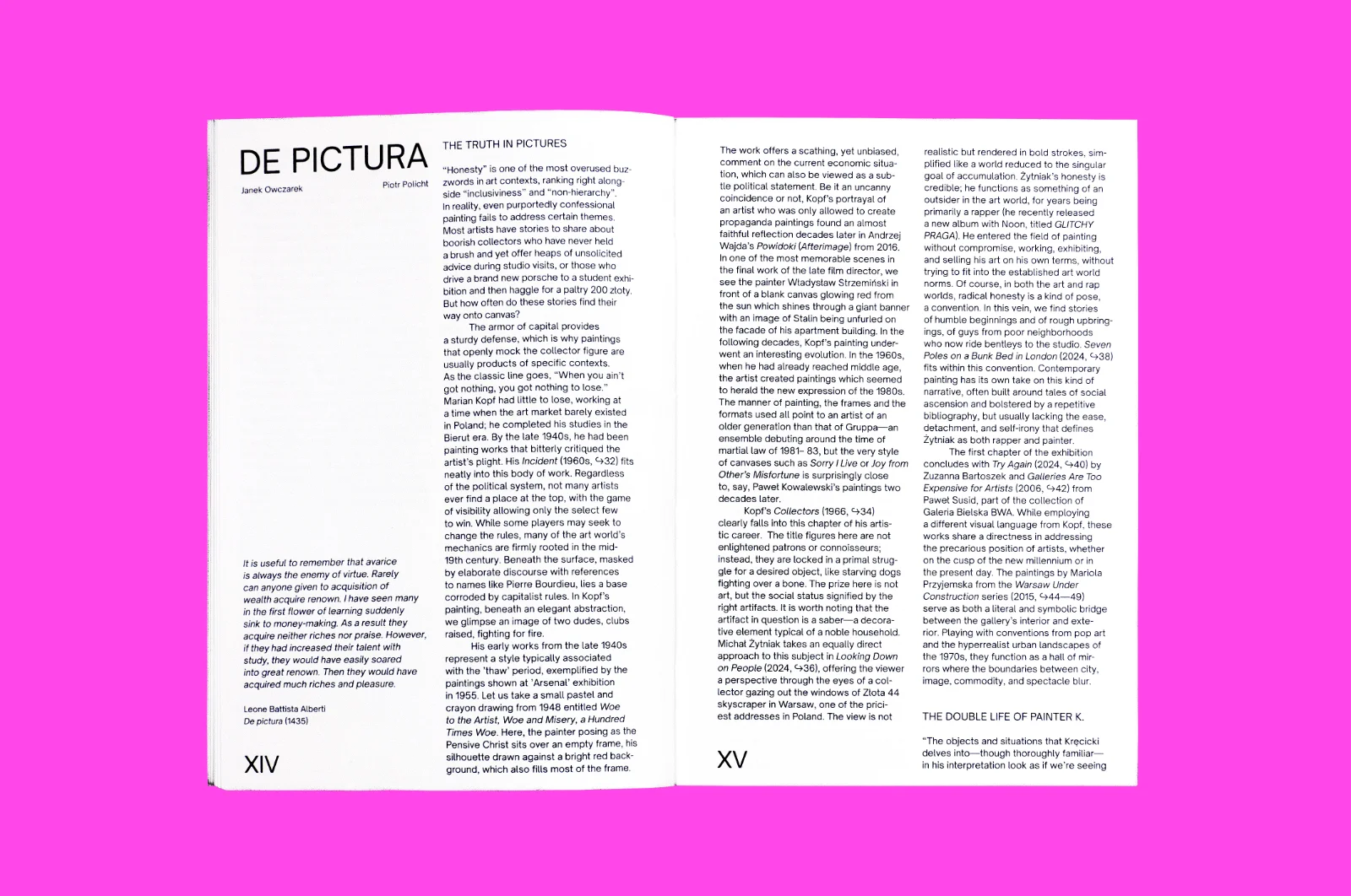
The exhibition was accompanied by a catalogue containing reproductions of all the paintings and two essays: one by the curators and one by Agata Pyzik. The book was published with two different covers featuring different paintings. Roman numerals were used for the essay section, and Arabic numerals for the section devoted to the artworks.