I design 🪄 and create 👷‍♂️ art:
kubamaria@mazurkiewicz.work
00 48 669 269 930

Ty i Ja

2024

Ty i Ja [You and Me] was a unique lifestyle magazine published in communist Poland in the 1960s and 1970s. The monthly featured articles on contemporary art and literature, interviews with famous artists, scientists, and intellectuals, guides, and recipes. In 2024, the History Meeting House in Warsaw opened an exhibition about the magazine. Julia Libera and Agata Szydłowska, the curators of the show, told the story of the people who made it – both journalists and graphic designers – in several sections reflecting the magazine’s content, such as fashion, dwelling, cinema, and literature.

It was a real treat and great pleasure for me as a designer to work with the vast Ty i Ja archive while creating the visual communication and the catalogue layout.
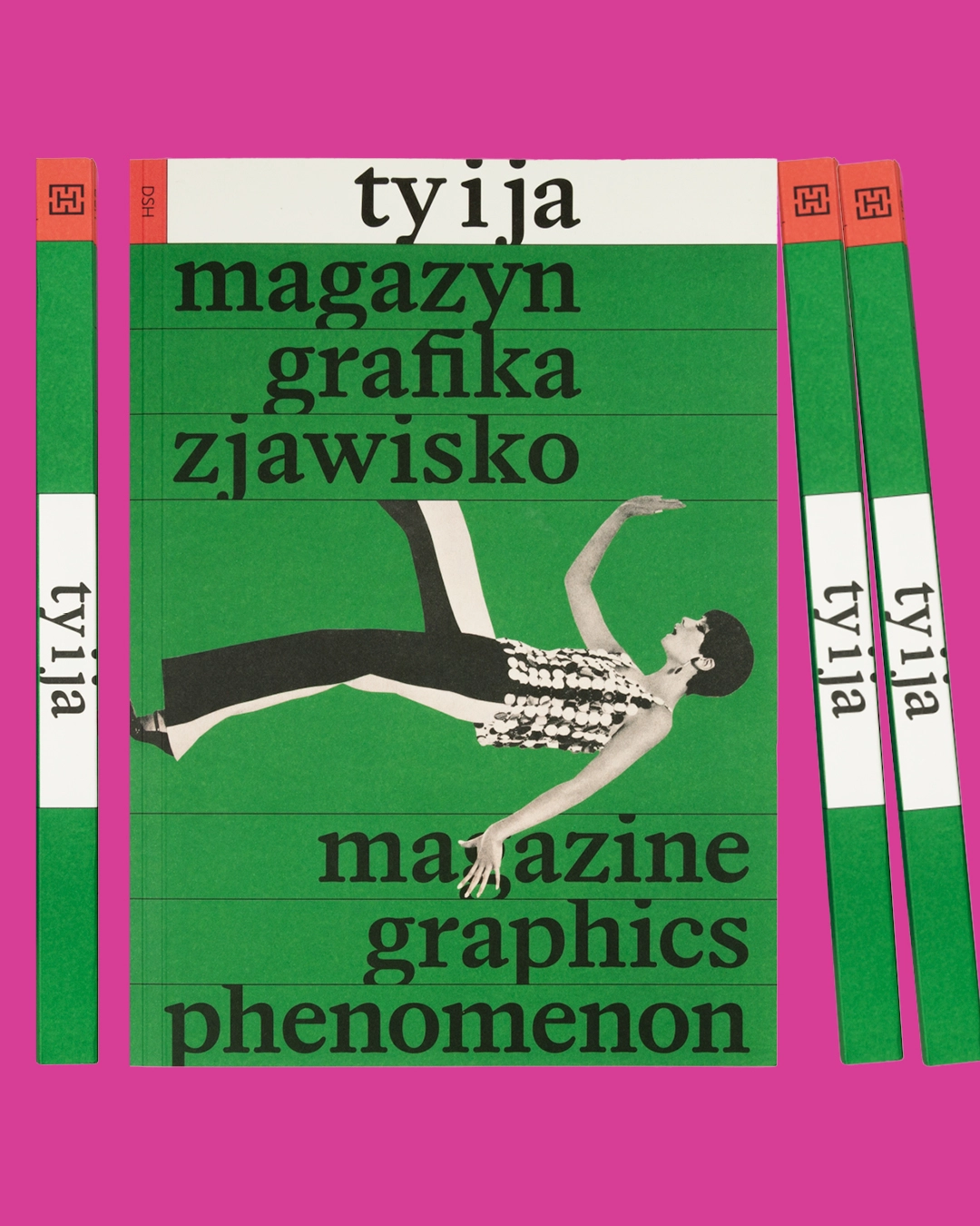
Front cover of the catalogue among three spines on a pink background. Green cover with the title “ty i ja” on a white band, the words “magazyn, grafika, zjawisko / magazine, graphics, phenomenon” and a cut-out photo of a woman in sequinned top and flared trousers lying diagonally.
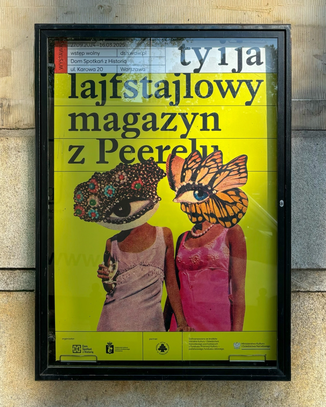
Exhibition poster in a city display case: black serif lettering “ty i ja lajfstajlowy magazyn z Peerelu” on acid yellow, above a collage of two women in 1960s dresses whose heads are replaced by a jewelled eye and a butterfly-wing eye.
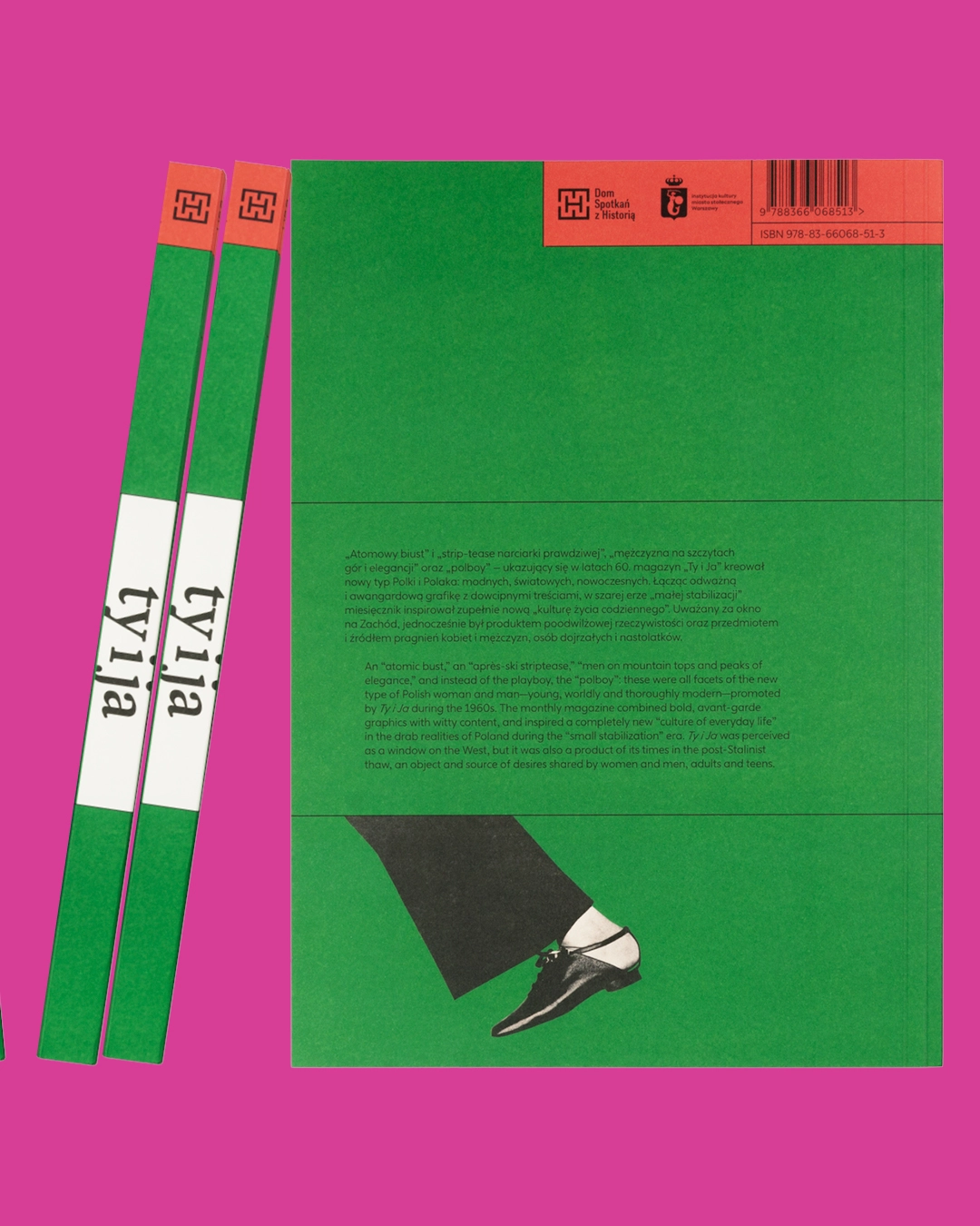
Back cover of the catalogue on a pink background: green with a red band holding logos and barcode, a bilingual blurb about the magazine, and a cut-out trouser leg and shoe stepping across the lower edge. Two spines lean on the left.

Whilst working on this project, I felt as though I were rebranding the magazine. However, the result wasn’t a new page layout, but posters and the visual identity of the exhibition and the book.

My starting point and main inspiration was the second Ty i Ja nameplate with its characteristic letters cropped at the top and bottom. I decided to keep the cropping rule, but apply it to contemporary typefaces. I chose two fonts by Jan Estrada-Osmycki from Tekio: Softcore for headlines and Pretty for body text.
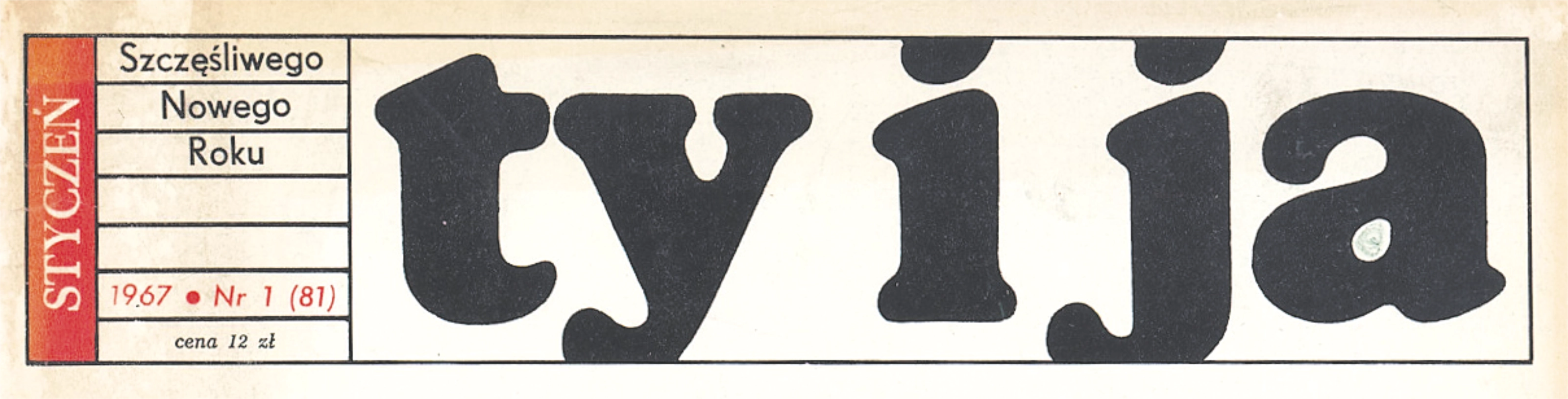
The second “Ty i Ja” nameplate from the January 1967 issue: heavy black rounded lowercase letters cropped at the top and bottom by the frame, next to a small box with the issue details and the price, 12 zł.

The second Ty i Ja nameplate

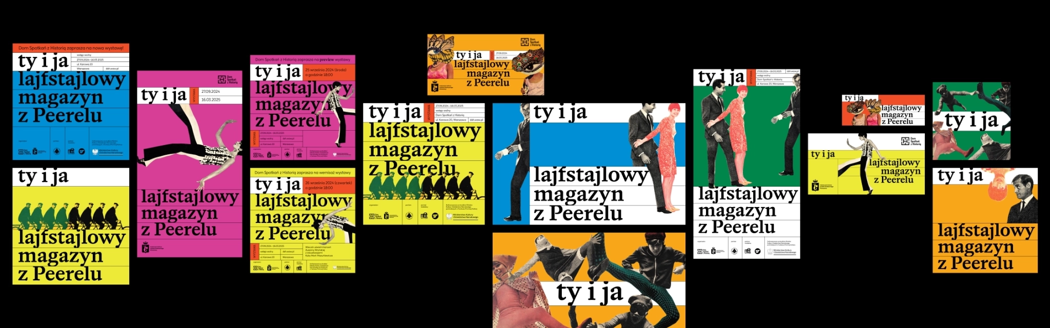
Overview of the visual identity on black: posters, banners and social media graphics in yellow, pink, blue, green and orange, all with the “Ty i Ja” nameplate and collaged 1960s photographs.

Today, a poster doesn’t come in one format: each place where it appears needs its own proportions. I usually just adapt the design to each new format, but here, with such a huge number of graphic gems to draw on, I was determined to create as many different designs as possible.
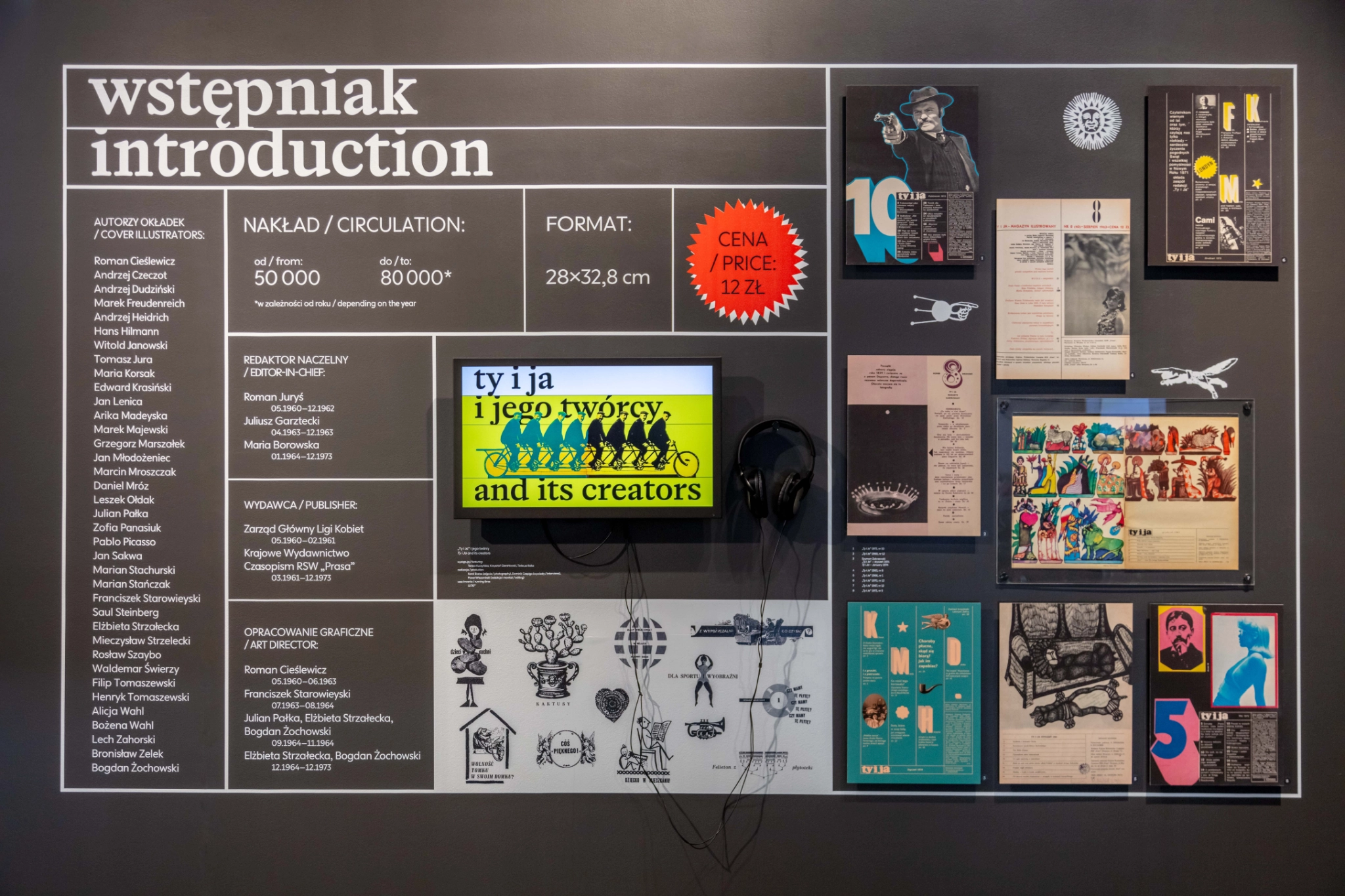
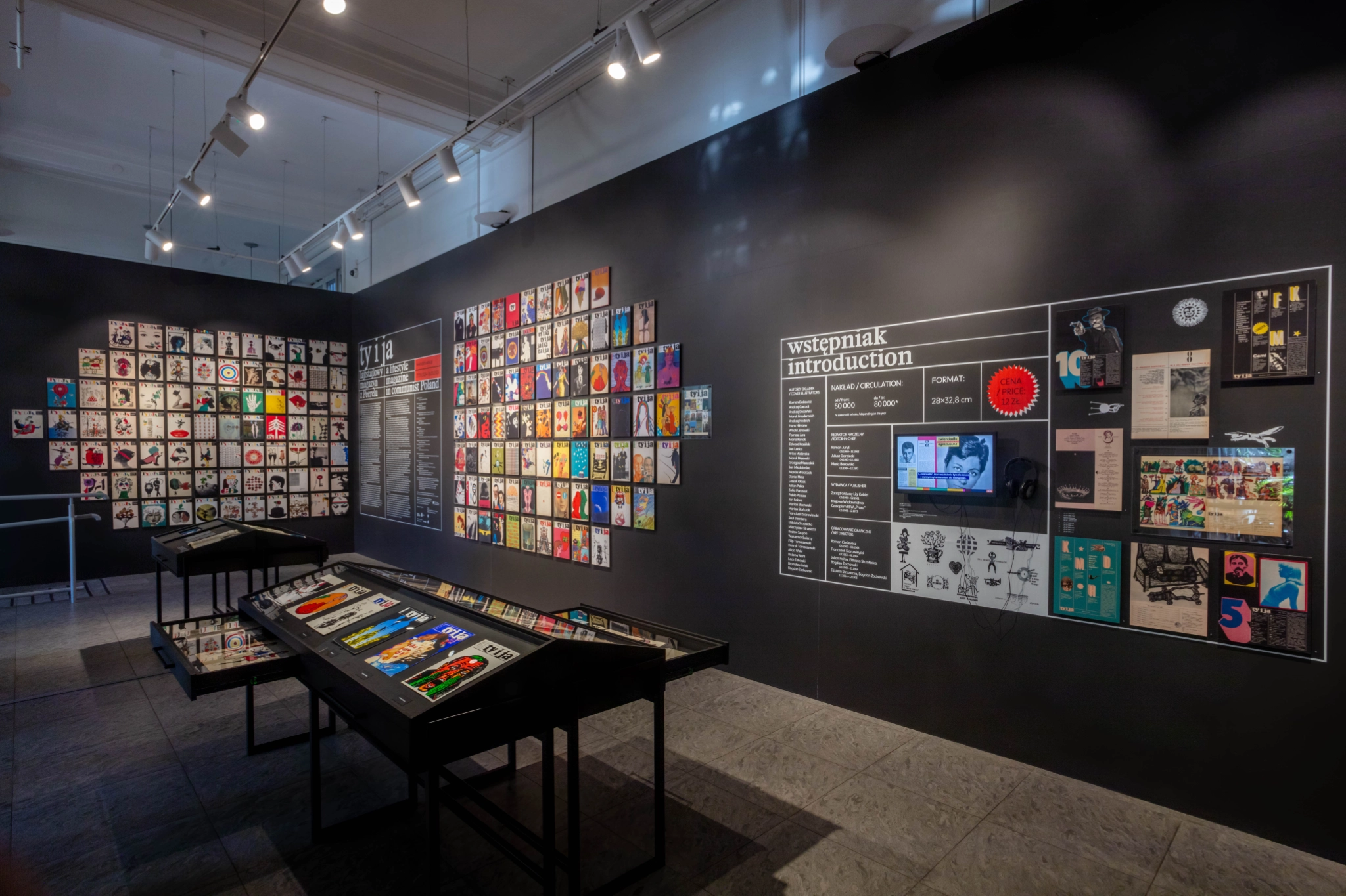
Exhibition wall titled “wstępniak / introduction”, painted in a white typographic grid on dark grey: lists of cover illustrators and editors, circulation, format, a red starburst with the price, a screen with headphones, and original magazine pages.

The vibrant exhibition design was created by Lotne Studio, based on my key visual, which set out the colour palette and typography. The show featured mainly material from Ty i Ja but also historic design tools, video interviews with the magazine’s creators, and much more.
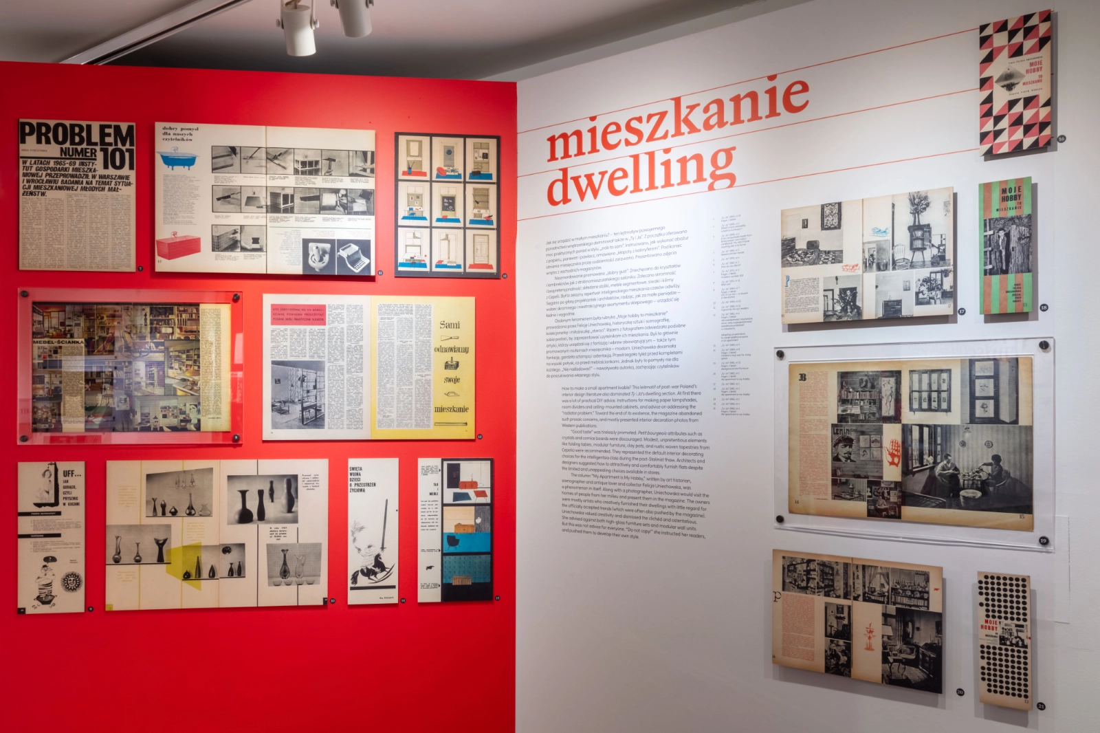
Exhibition section “mieszkanie / dwelling”: magazine spreads on interior design mounted on a red wall and a white wall with a bilingual text and red title lettering.
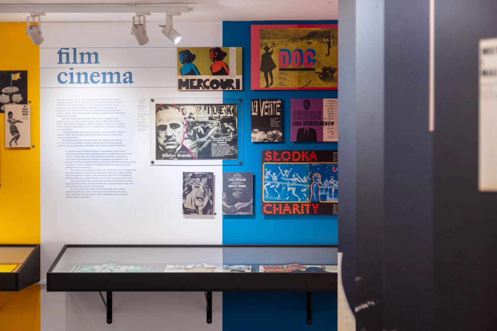
Exhibition section “film / cinema”: a white wall with a blue title and bilingual text next to a blue wall hung with Polish film posters and magazine pages, with a display case below.

View of the exhibition room: dark walls covered with grids of colourful magazine covers, the introduction wall on the right, and sloping display cases in the middle.

Exhibition photos by Maks Januszewicz / DSH
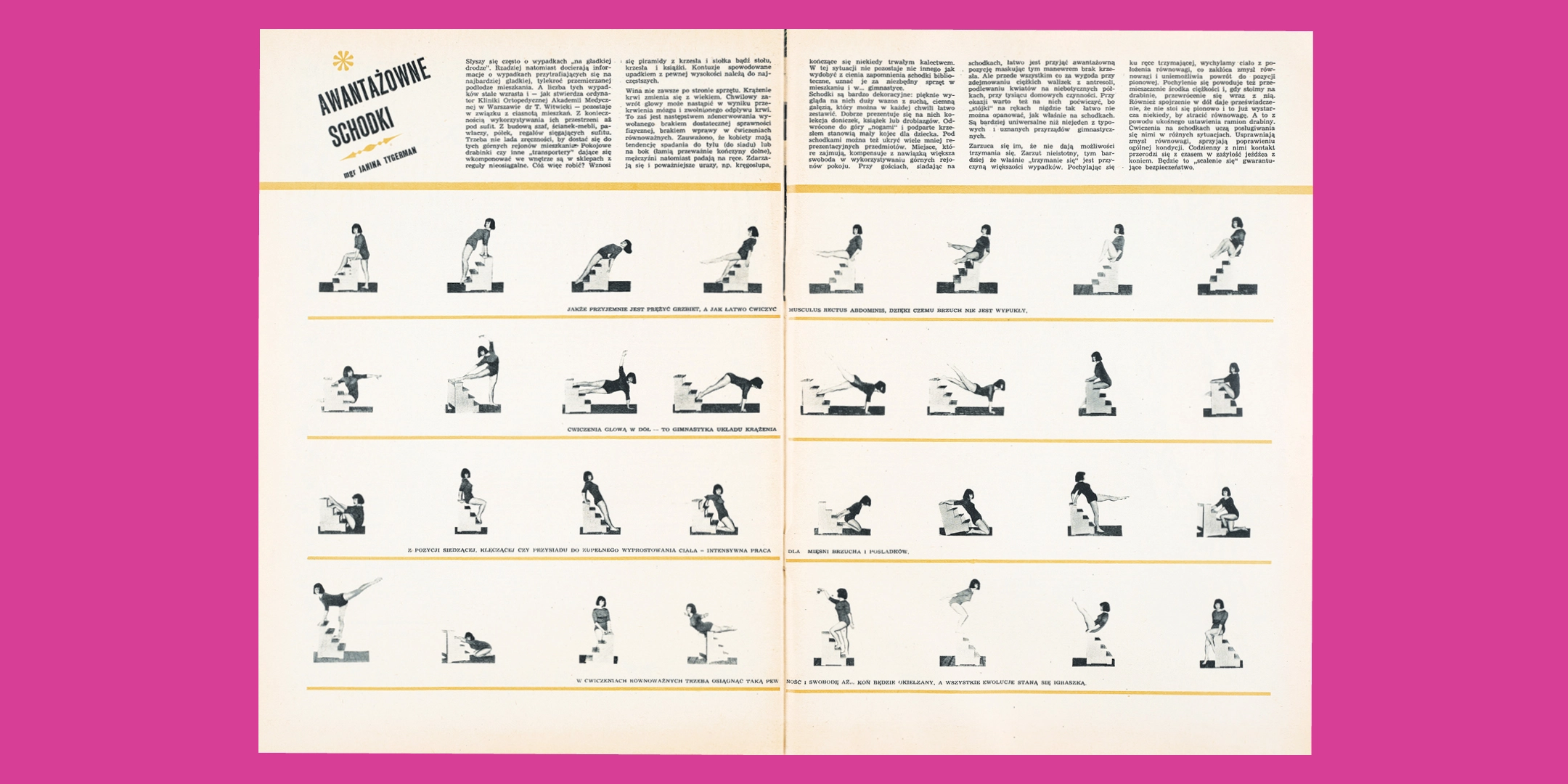
Magazine spread “Awantażowe schodki” on a pink background: rows of small black-and-white photos of a woman doing exercises on a small set of steps.

Composing the catalogue pages was a process of selecting, sorting, and finding the best relationships between fragments and details from the historic source. The research, especially into the visual content, led to plenty of surprising discoveries – like these animations, which I found on one of the spreads and set back in motion.

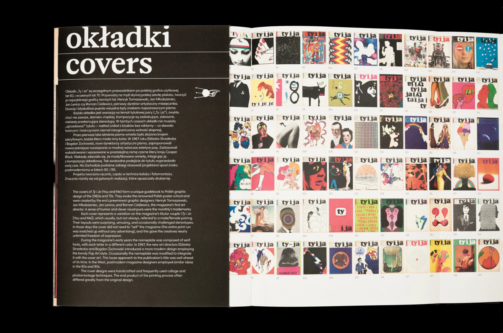
The catalogue has similar proportions to the magazine, but it is smaller, so that it is easier to handle. A key element is a list of all the original covers, shown on two fold-out pages. The colours and typefaces are consistent with those of the exhibition. Its 180 pages are filled with photographs, original graphic designs, and sophisticated details.
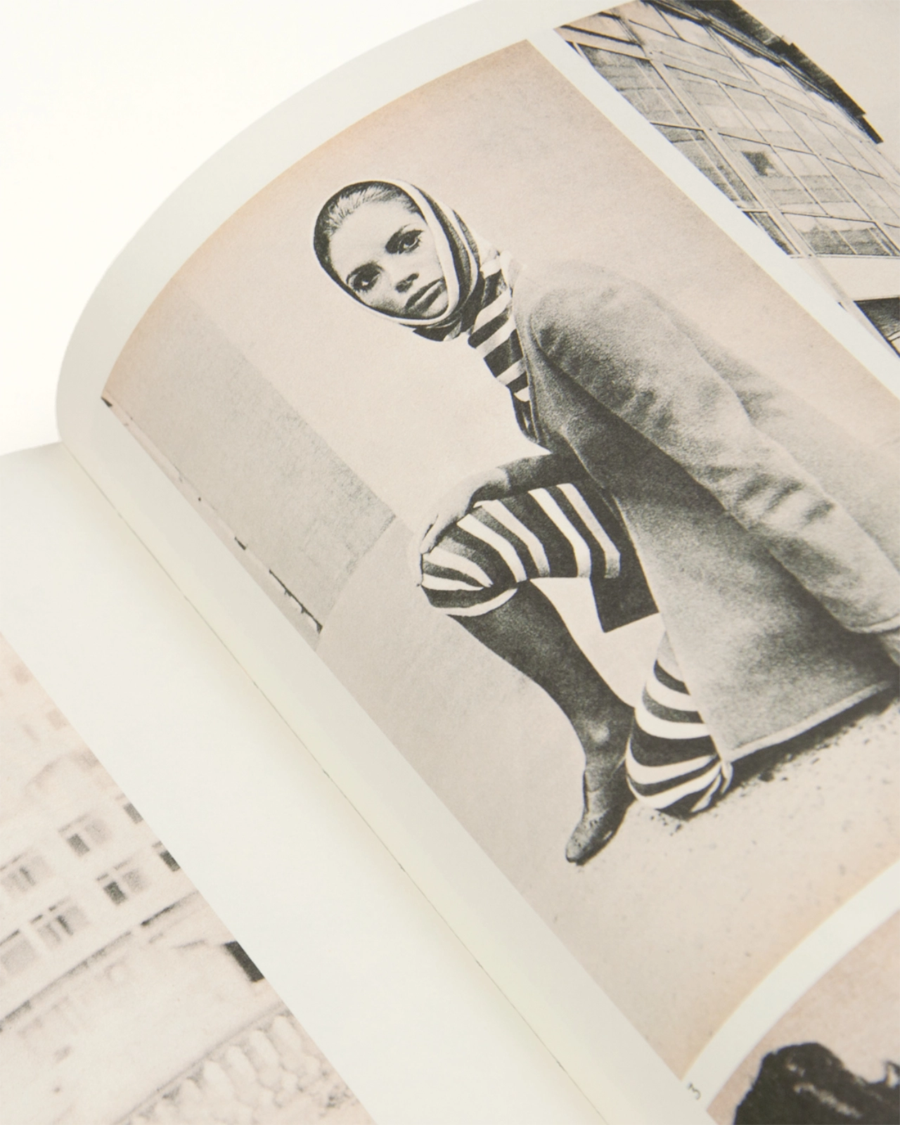
Close-up of an open catalogue page: a black-and-white fashion photo of a model in a headscarf, coat and striped tights, crouching on a pavement.
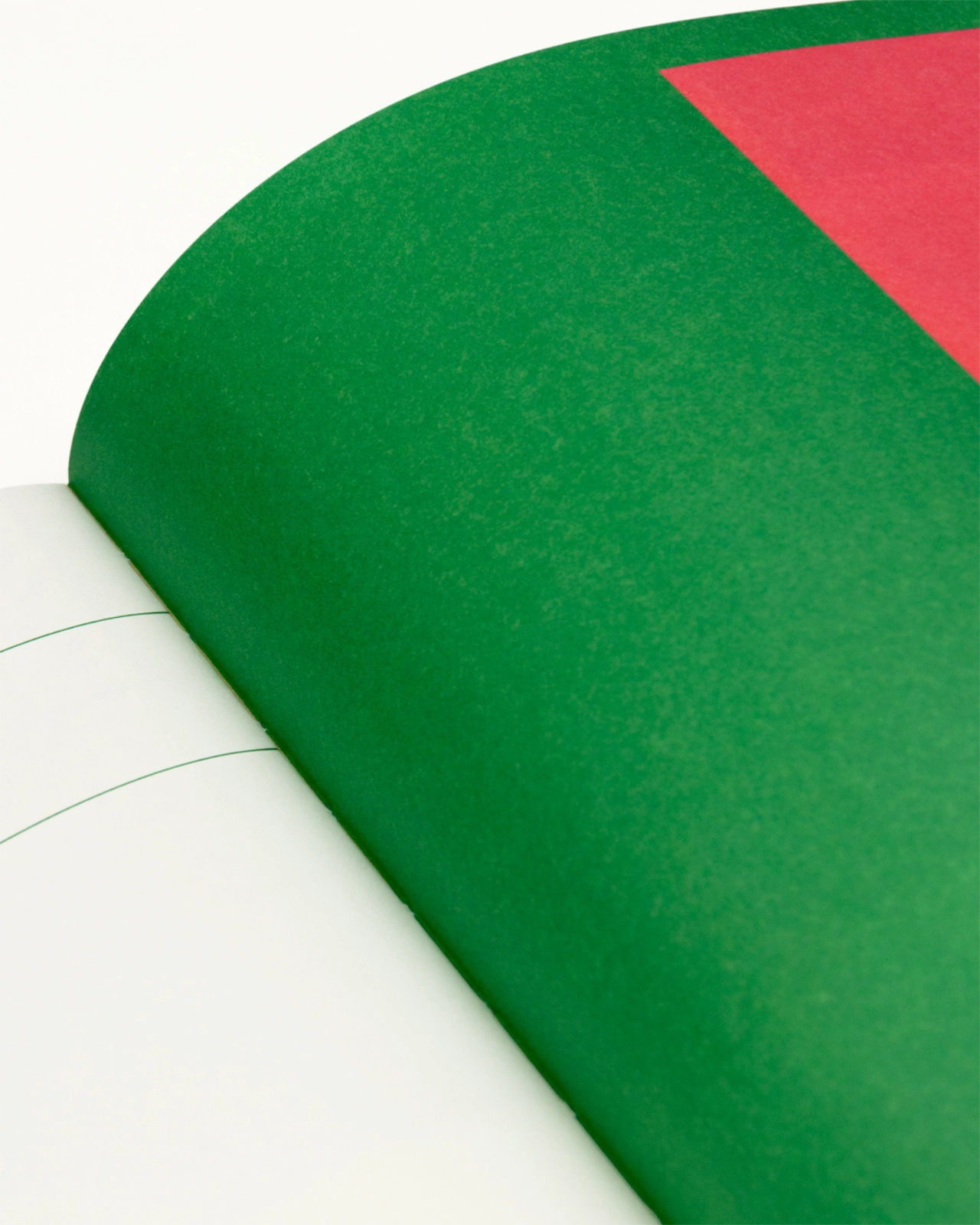
Close-up of an open catalogue: a flat green page with a red block in the corner, facing a white page with thin green lines.
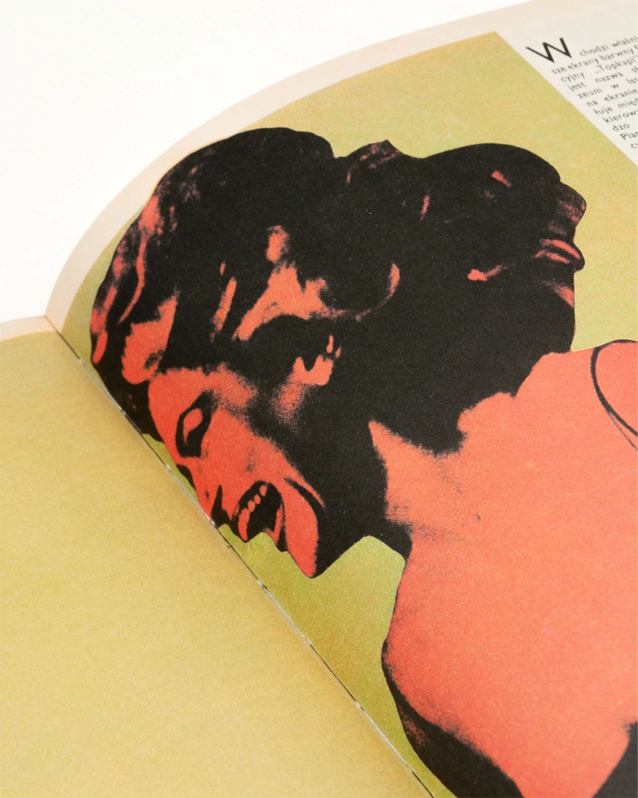
Close-up of an open catalogue page: a red and black halftone image of a woman’s face in profile, mouth open, on an olive background.
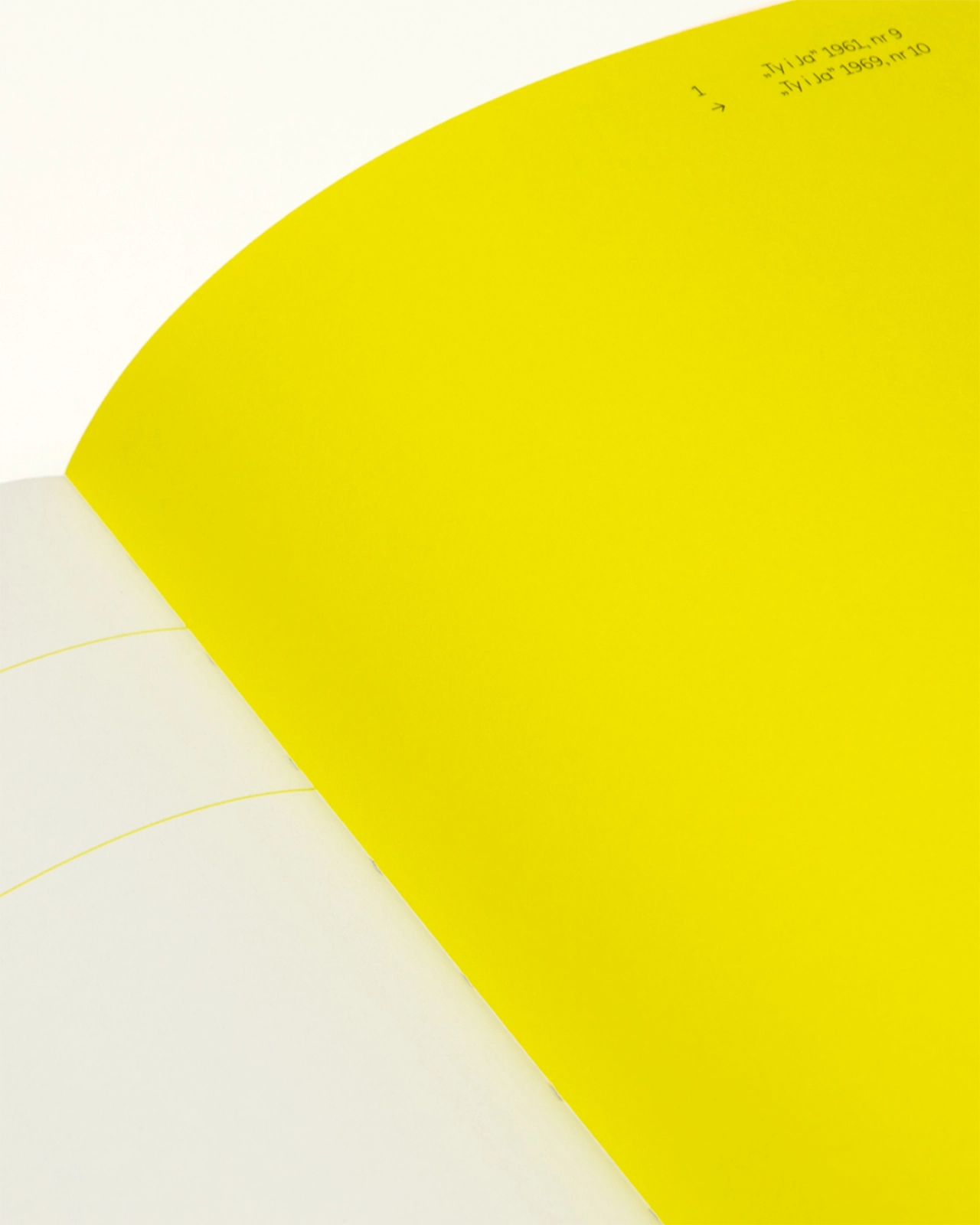
Close-up of an open catalogue: a flat bright yellow page with small captions in the top corner, facing a white page with thin yellow lines.
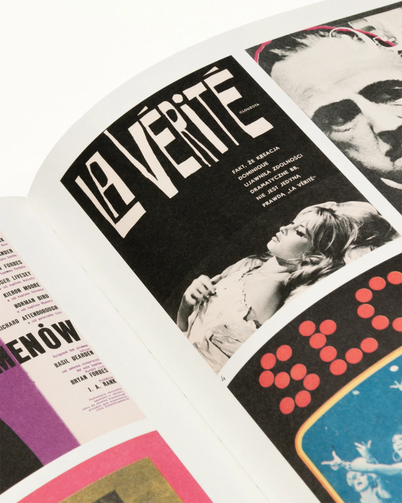
Close-up of an open catalogue with reproduced film posters, including “La Vérité” with Brigitte Bardot, and a red dotted lettering on black.
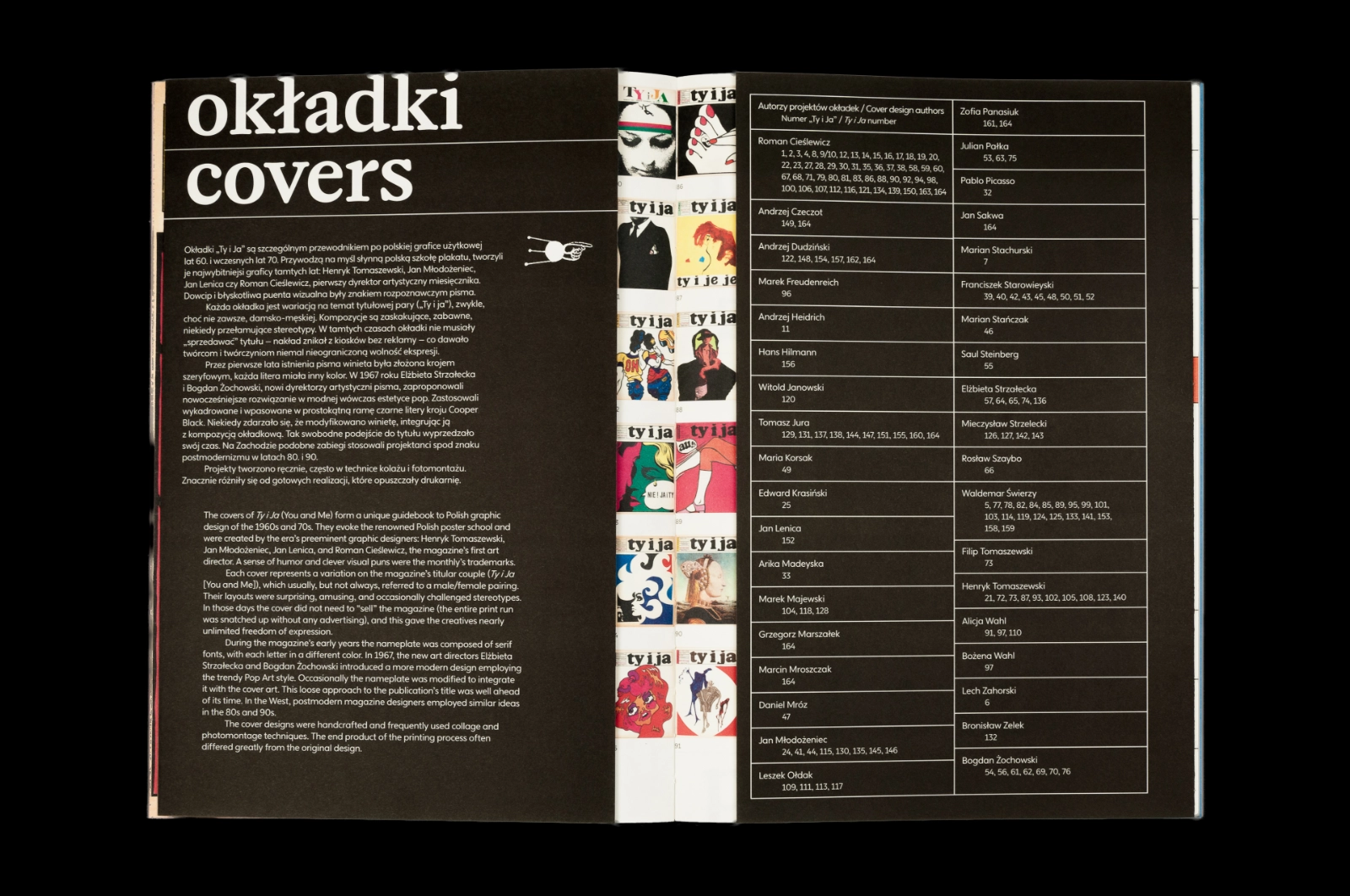
Catalogue spread “okładki / covers” on black: bilingual text on a black page, a narrow strip of cover reproductions, and a table of cover designers with issue numbers.
Catalogue spread “okładki / covers” on black: bilingual text on the left and a grid of about seventy small reproductions of colourful magazine covers on the right.
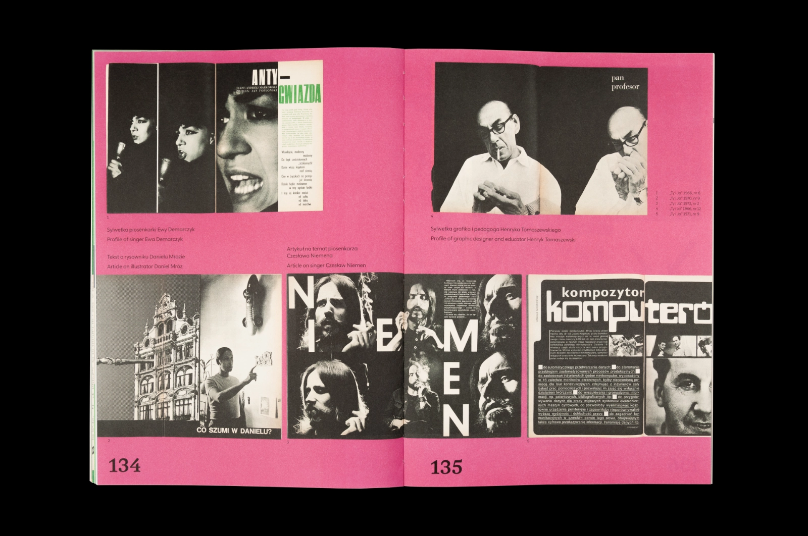
Catalogue spread on a pink background, pages 134–135: magazine profiles of singer Ewa Demarczyk, graphic designer Henryk Tomaszewski, illustrator Daniel Mróz, singer Czesław Niemen, and an article titled “kompozytor komputer”.
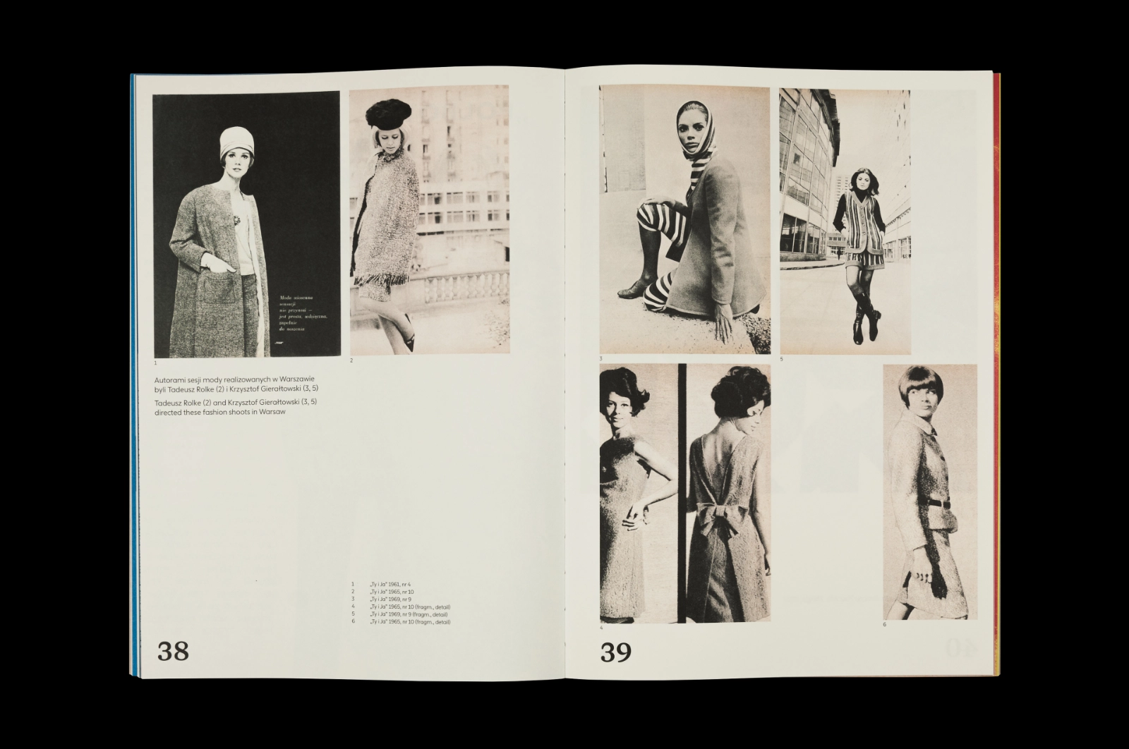
Catalogue spread, pages 38–39: black-and-white fashion photographs of women in coats, dresses and suits, shot on the streets of Warsaw, with captions.
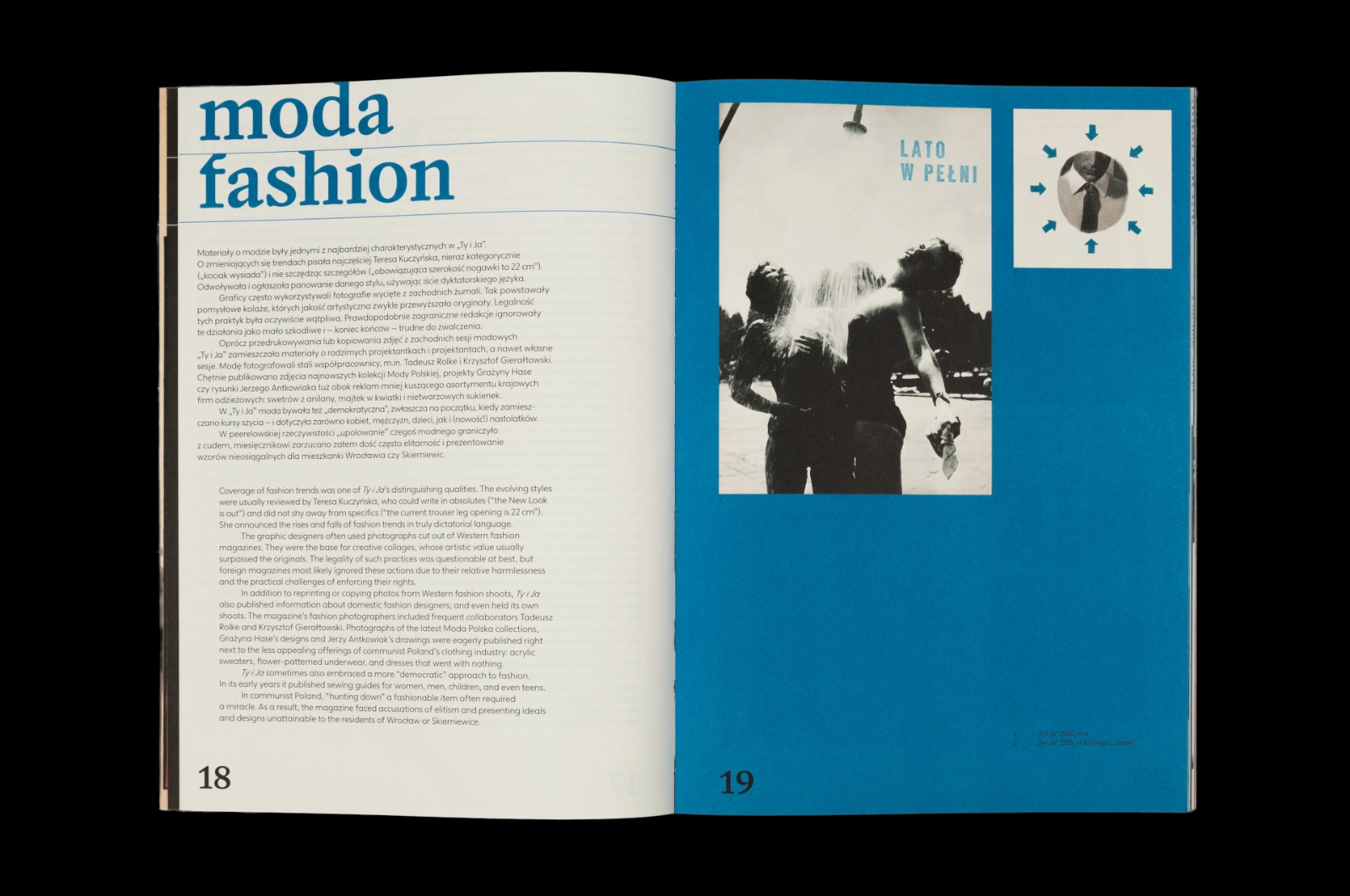
Catalogue spread “moda / fashion”, pages 18–19: bilingual text on a white page with a blue title, facing a blue page with a black-and-white photo of a couple under a shower and a small illustration of a tie.
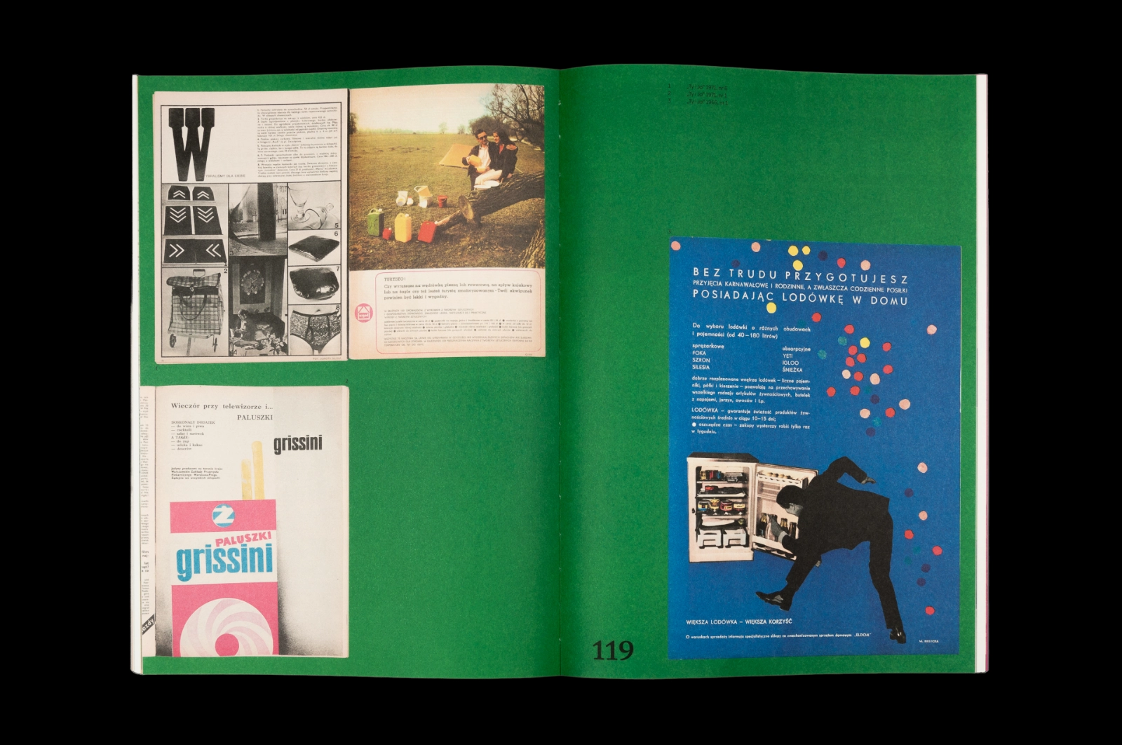
Catalogue spread on a green background, page 119: reproduced magazine advertisements, including grissini breadsticks and a blue fridge ad with a man leaping towards an open fridge.

The book received two awards in the Institute of Industrial Design’s competition: Good Design and a special award named after the Institute’s founder, Wanda Telakowska.

In their statement the jury said:

The prize was awarded for an exceptional visual journey to the time of the Polish People’s Republic. The awarded album contains a curated selection of materials from the Ty i Ja monthly – reproductions of original spreads, collages and individual illustrations, and texts explaining the historical and cultural context.
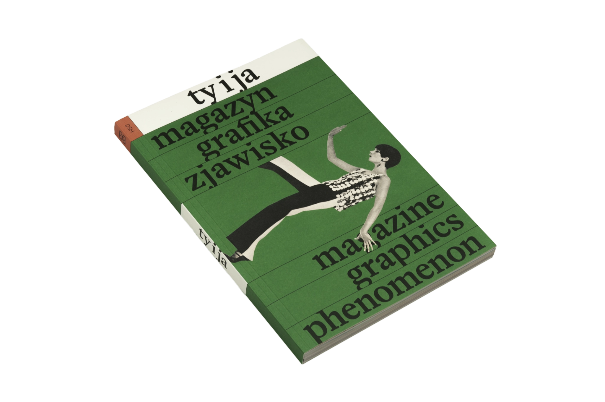
The catalogue “Ty i ja” lying at an angle on black, showing its green cover with the cut-out photo of a woman and the bilingual subtitle.